Apple
- Company
- Apple
- Team
- Design, Research, Engineering
The product
Apple Support is the primary self-service destination for hundreds of millions of Apple users. The project was a full redesign of the support section on apple.com, with the goal of unifying the support experience across Apple’s entire product ecosystem. The challenge was designing a structure that could handle extremely dense, technical content while remaining effortlessly browsable for every type of user.
The design challenge
Apple’s support content is vast. Thousands of articles covering every product, every OS version, every edge case. The existing structure had grown organically, making it difficult for users to find specific information without already knowing what to look for. The redesign needed to serve two very different user behaviors: people who know exactly what is wrong and want a direct answer, and people who have a vague problem and need to be guided toward the right solution.
How I worked
I worked on the redesign as part of a broader initiative to unify Apple’s support experience across its product ecosystem. My work spanned research, information architecture, and interaction design for the core support flows.
- Understanding user behavior We started by analyzing how people actually use support content. Two dominant patterns emerged: directed search (users who know their problem and want a direct answer) and guided exploration (users with a vague issue who need help narrowing down the cause). Every design decision had to serve both behaviors without making either feel like a secondary path.
- Restructuring the information architecture We redesigned the content hierarchy from product hubs down to individual articles. The existing structure had grown organically and no longer matched how users thought about their problems. The new architecture follows a consistent narrowing principle: start broad, let the user’s choices refine the content, and always provide an escape path to search, community, or direct support.
- Designing content formats We designed the article templates that structure how support content is consumed. Rather than a single article format, we created distinct formats optimized for different content types. Each had its own interaction pattern but shared the same visual language and navigation model.
Key design decisions
Three decisions that shaped the redesign.
01Search as the core interaction
The problem. The existing support experience relied heavily on browsing through product categories and topic hierarchies. For users who could articulate their problem, this was unnecessarily slow. For users who could not, the categories often did not match their mental model of the issue.
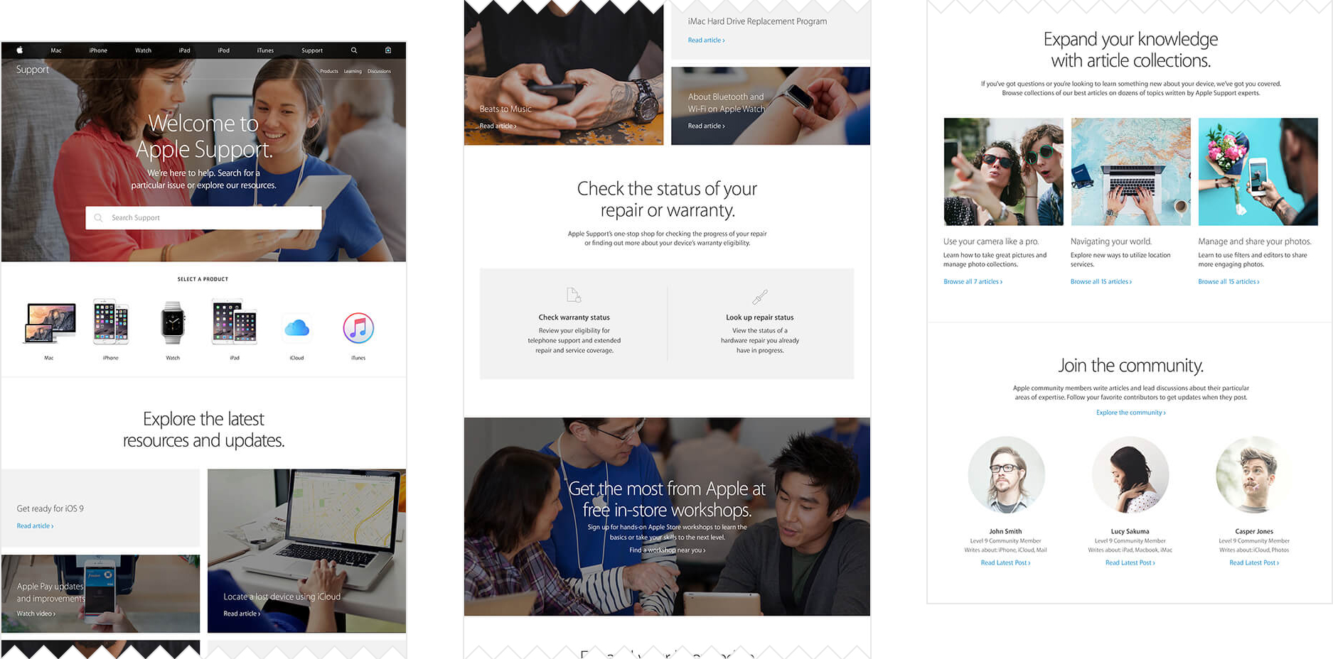
What we designed. We placed search at the core of the support homepage. This aligned with Apple’s broader initiative to consolidate its search engine across the ecosystem. The search function became the primary entry point, with the content below organized as a curated mix of popular articles, resources, and community content, providing an alternative browsing path for users who prefer to explore rather than search.
02Progressive narrowing: general to specific
The problem. Users arriving at a product hub page (iPhone, Mac, iPad) faced a flat list of topics with no clear path from a general area of confusion to a specific resolution. The information architecture did not guide the user through a diagnostic flow.
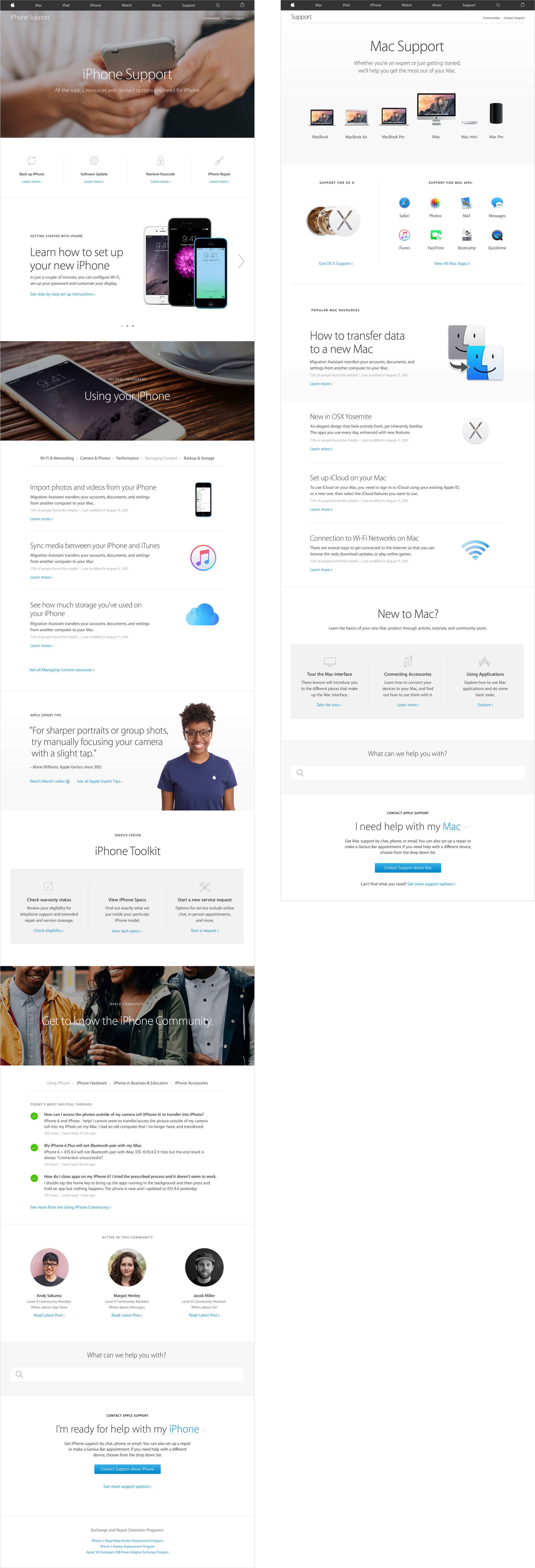
What we designed. Every page in the support section follows the same structural principle: start with general topics and narrow down to specifics based on user input. Product hub pages present common issues and resources organized by theme. As the user makes choices, the content refines itself. If no answer is found at any level, the page offers three escalation paths: search, community, or direct Apple support contact. This safety net ensures no user reaches a dead end.
03Two article formats for two types of problems
The problem. Support articles had one format, regardless of the type of content. A troubleshooting article with multiple possible causes used the same layout as a step-by-step setup guide. Users could not scan articles to find the specific solution to their variant of the problem.
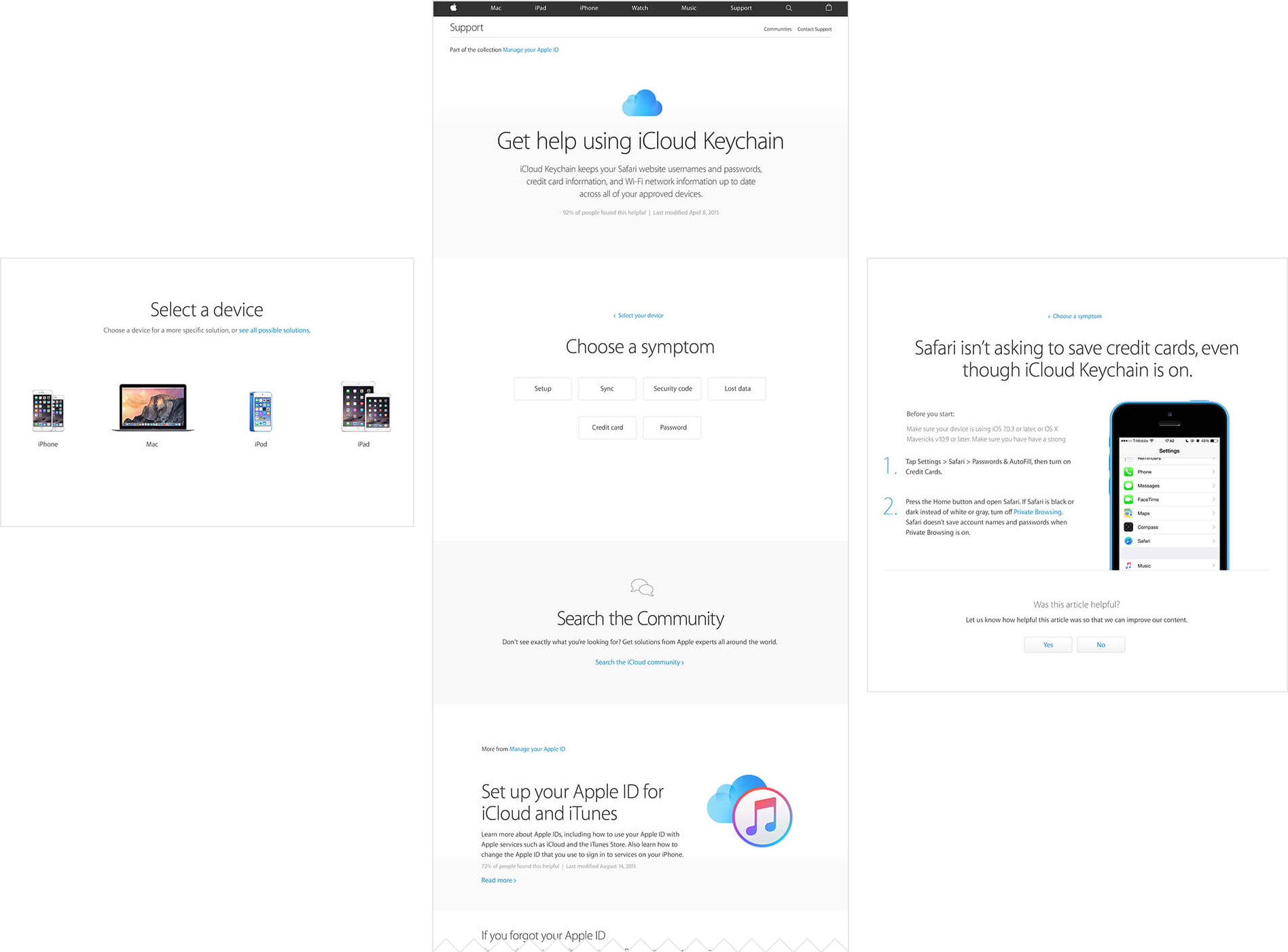
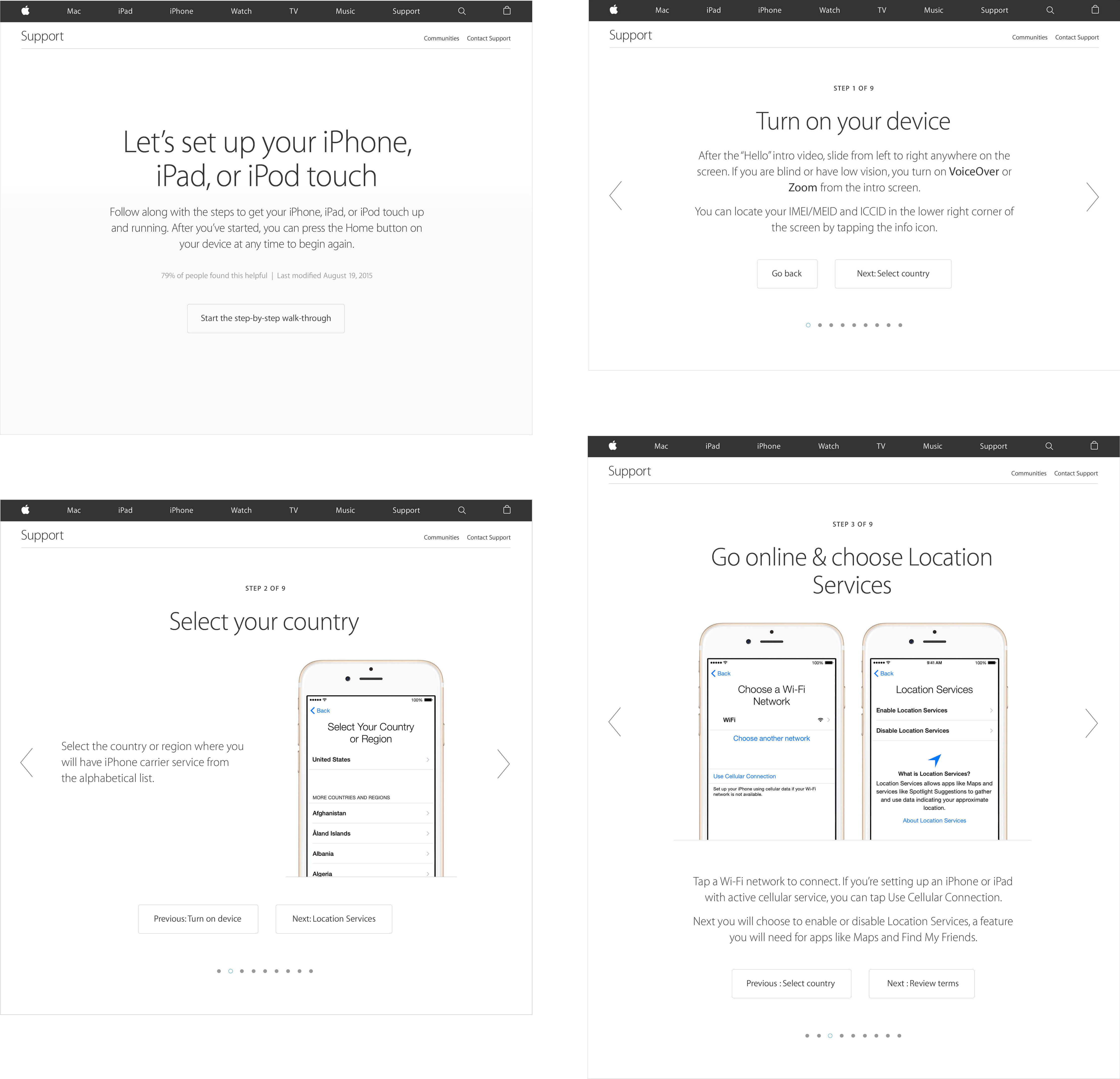
What we designed. Two distinct article formats, each optimized for a different type of content. The “multiple choice” article lets users select their specific situation from a set of options and receive a targeted answer. This format works best for problems that have multiple possible causes. The “stepper” article breaks a process into sequential steps with clear progression, and is built for guided walkthroughs where the user needs to follow a specific order.
What I took away
Designing for support content taught me that information architecture is not about organizing content logically. It is about designing for the user’s state of mind. Someone with a broken phone is frustrated and impatient. Every extra click, every ambiguous category label, every wall of text adds friction to an already stressful moment. The design had to meet that emotional state, not just the informational need.
The two article formats were a small decision with outsized impact. Matching the format to the content type reduced the time users spent scanning for their specific situation. It also made the content easier to maintain, because authors had a clear framework for how to structure new articles.