Akbank
- Company
- Akbank
- Team
- Design, Product, Engineering
The product
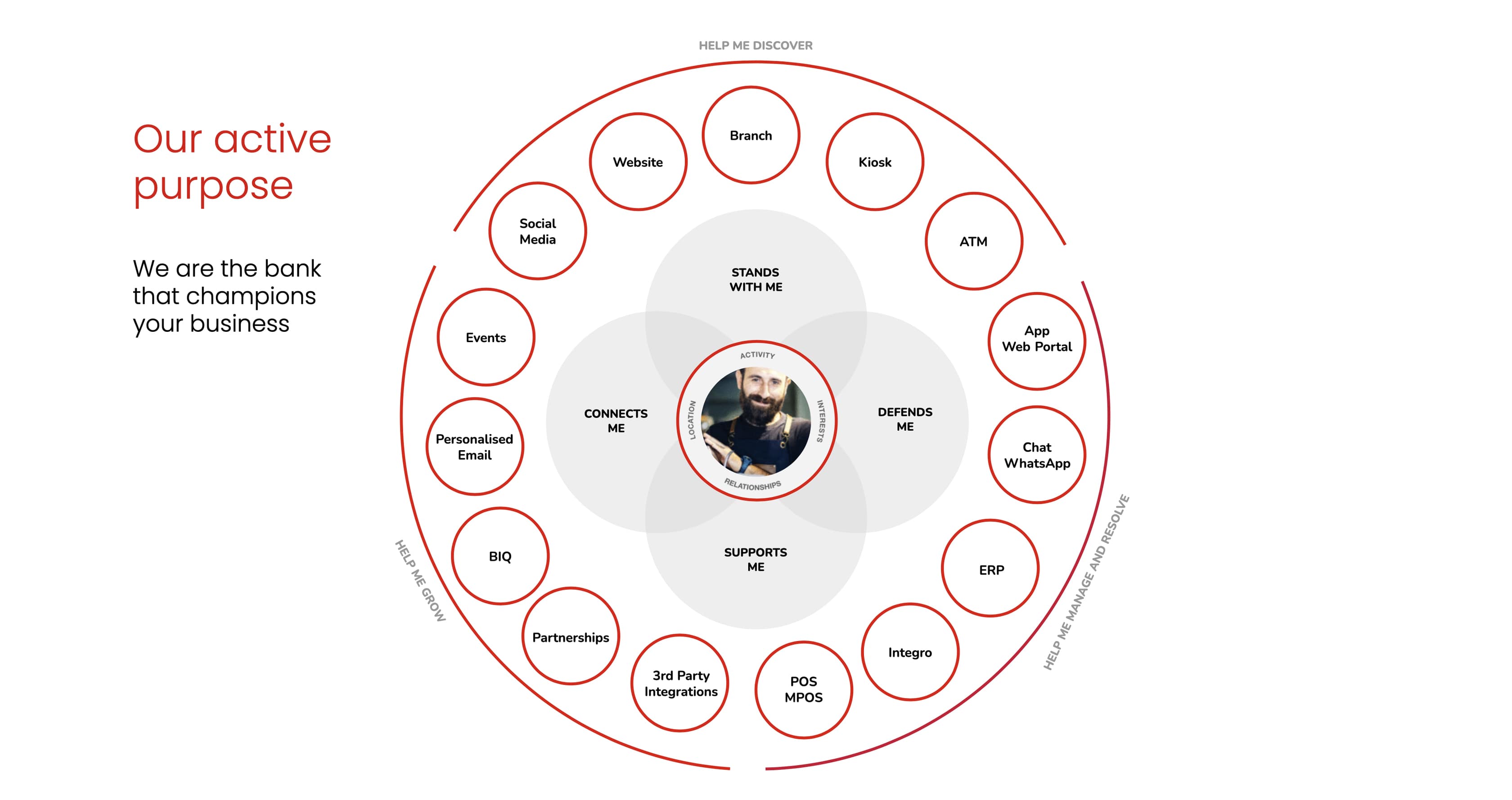
Akbank is one of Turkey’s largest private banks, serving millions of corporate and SME customers. The project was a full digital transformation of their non-consumer banking platforms, bringing together corporate internet banking and the SME mobile app under a unified vision. One brand, one platform, one experience.
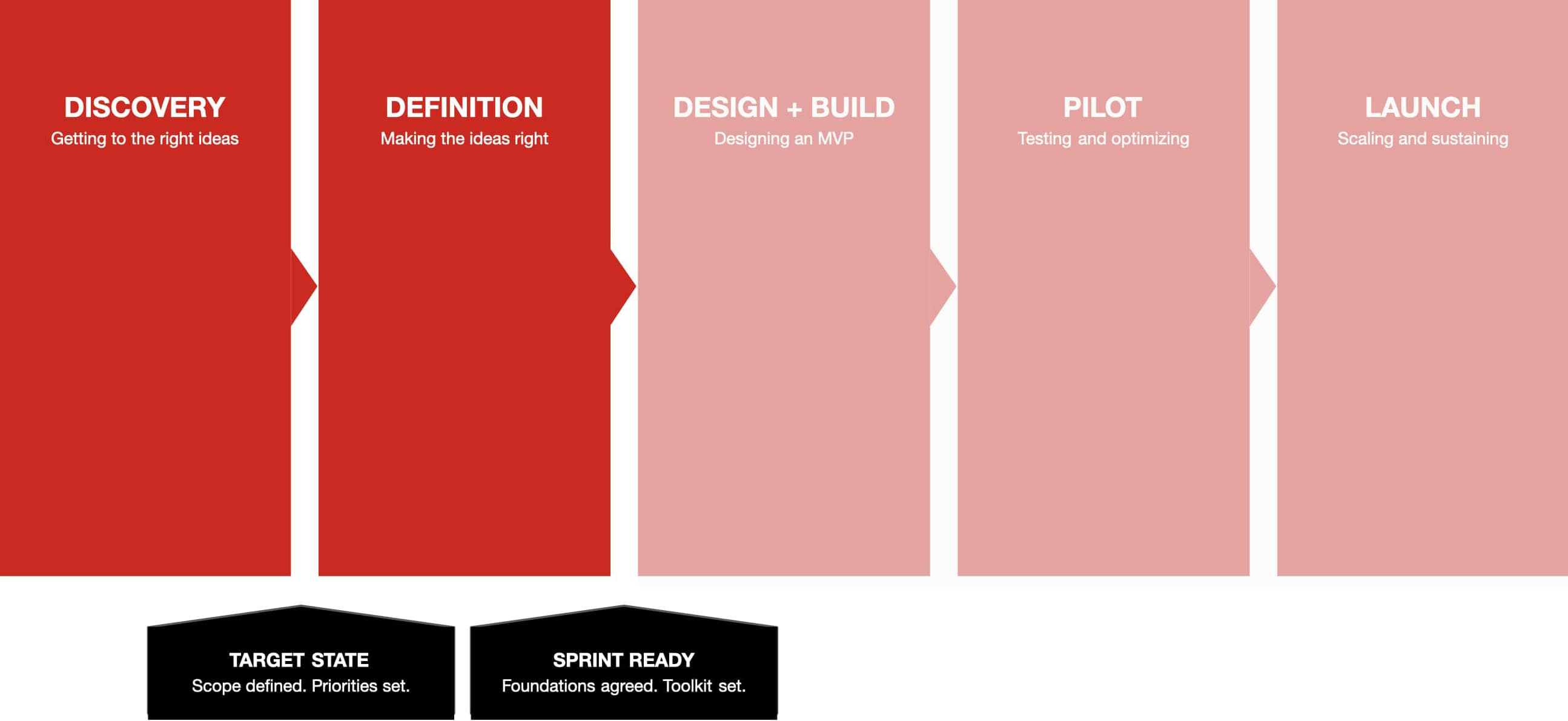
The work covered two structured phases:
- Discovery Getting to the right ideas. Ecosystem audit, competitive benchmarking, stakeholder interviews, user research interrogation, persona creation, Jobs To Be Done mapping, and idea prioritization.
- Definition Making the ideas right. Golden path journeys, sitemap and navigation design, product bundle logic, POS onboarding, dashboard design, group company management, and relationship manager communications.
The design challenge
Akbank’s digital banking experience had grown organically. Corporate internet banking and the SME mobile app were separate products with separate logic, separate navigation, and no shared design language. A small business owner checking cash flow on mobile had a completely different experience than a corporate treasurer managing multi-entity accounts on desktop.
The challenge was not just visual unification. It was structural: how do you design a single platform that serves a sole trader managing one account and a corporate group managing dozens of subsidiaries, without making the simple case feel heavy or the complex case feel constrained?
How I worked
I joined during the Discovery phase and worked through Definition across a four month engagement. My role sat between strategy and design, turning research findings into interaction frameworks, then translating those frameworks into testable prototypes.
- Mapping the landscape We started with an ecosystem audit of both the corporate internet banking platform and the mobile app. We documented where the interface was inconsistent, where task flows were fragmented, and where assumptions about user types broke down. We then benchmarked against best in class examples in banking and financial services to identify baseline expectations and differentiation opportunities.
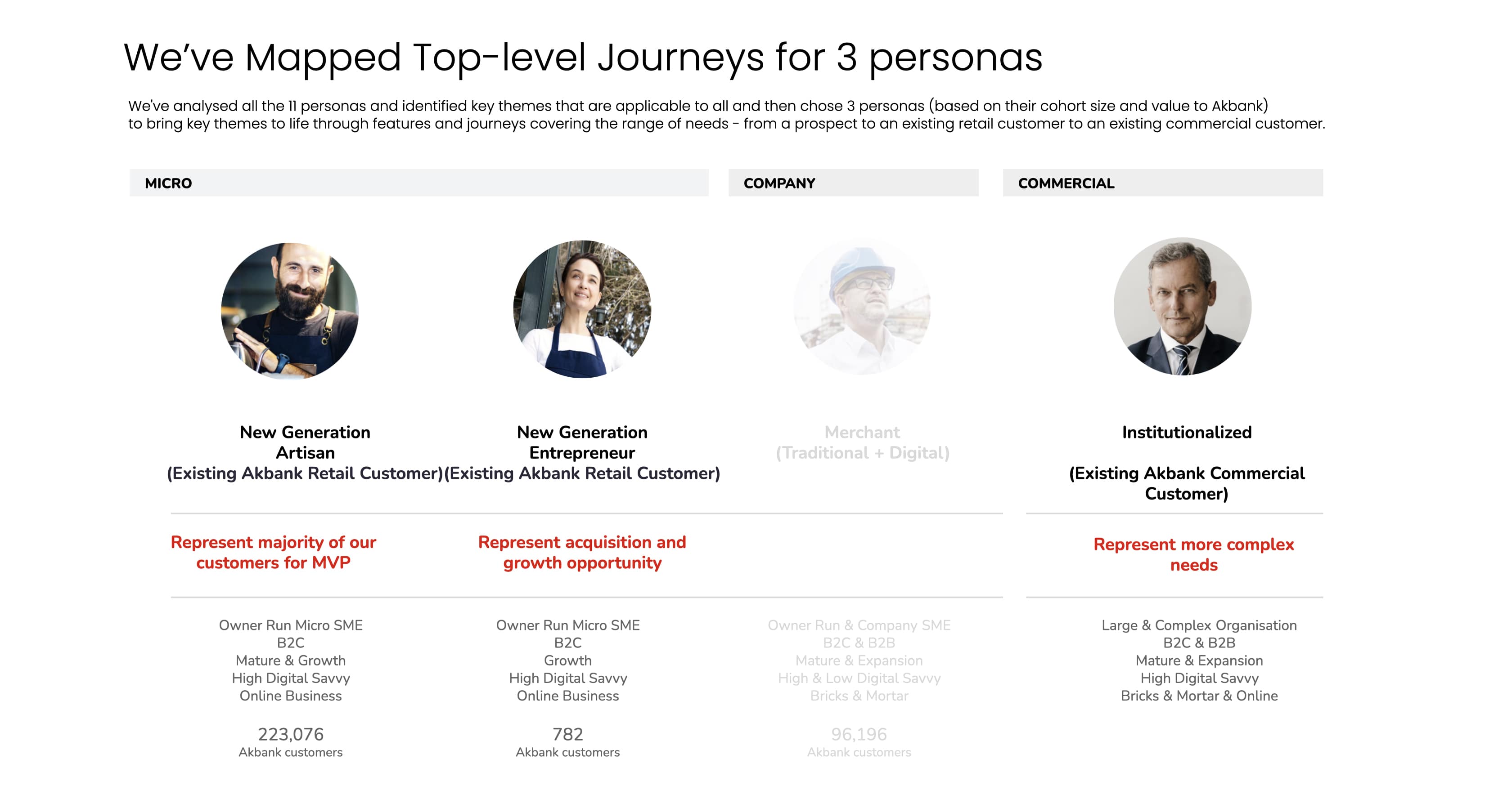
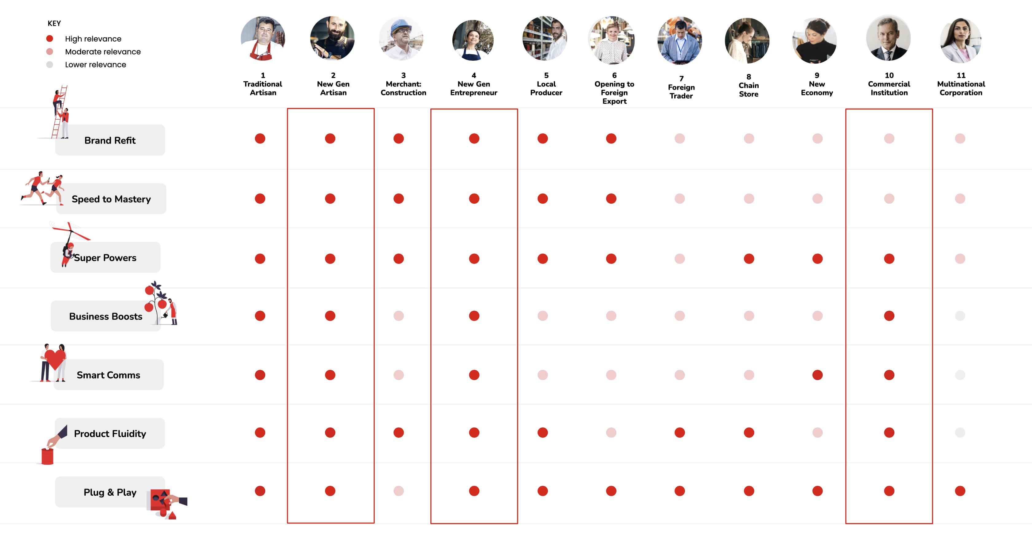
- Understanding users through Jobs To Be Done Working from stakeholder interviews and user research, we defined distinct personas covering SME owners, corporate finance teams, and relationship managers. For each persona, we mapped Jobs To Be Done to customer journeys, identifying where the greatest impact could be made and where common themes emerged across user types.
- Designing and testing In the Definition phase, we created golden path journeys for each persona, designed the new navigation and sitemap, prototyped key flows (bundles, POS onboarding, dashboard, group management), and ran remote user testing to validate designs before handover.
Discovery
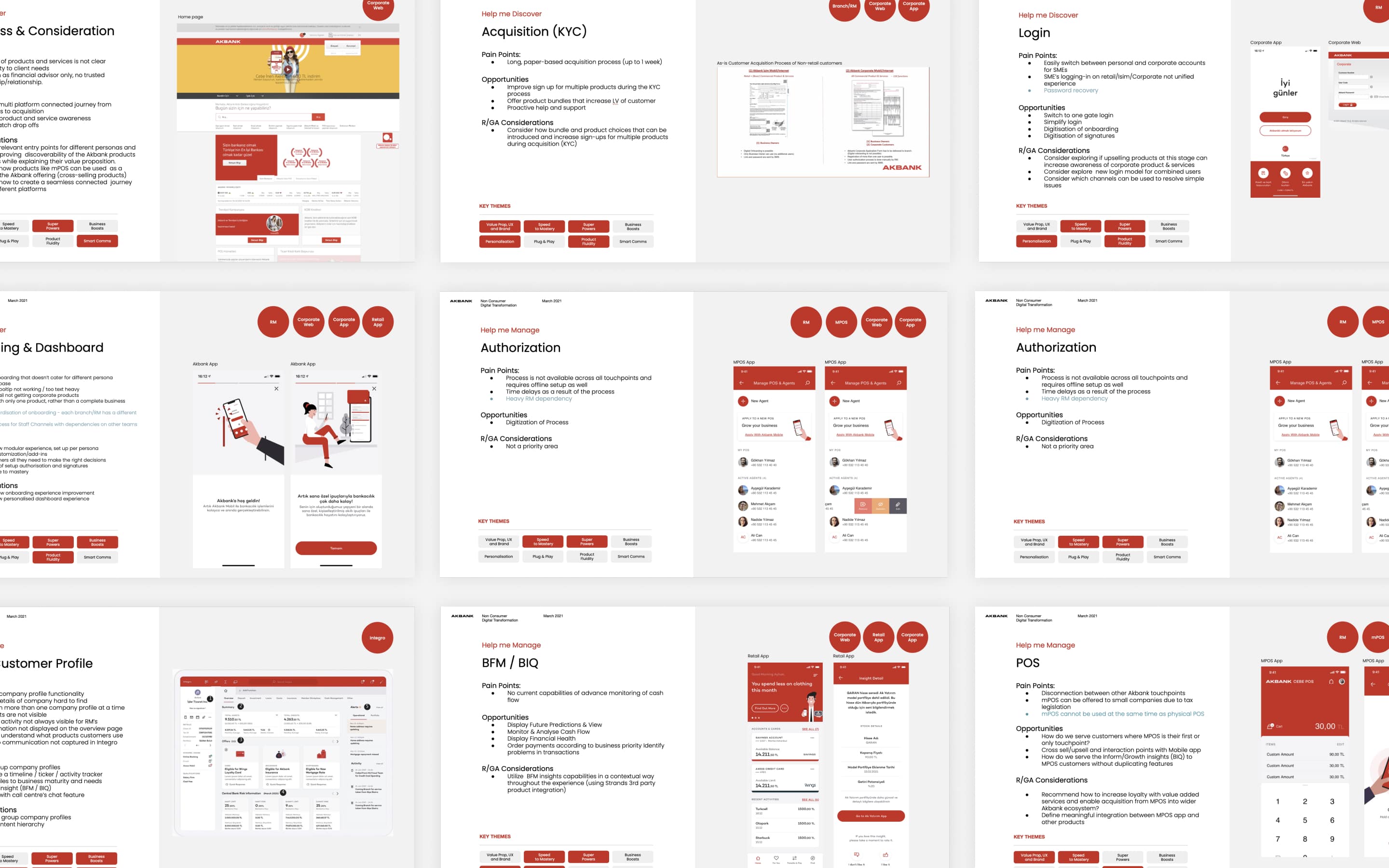
We assessed the current state across Akbank Corporate Internet Banking and Mobile App, identifying elements that work well and uncovering areas for improvement against competitive benchmarks.
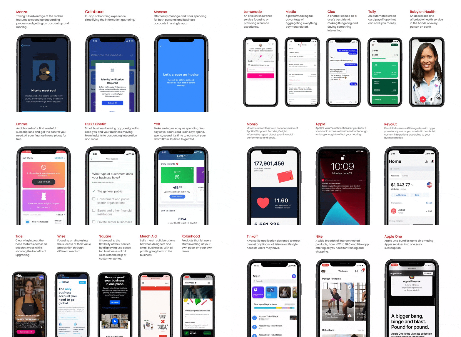
We took time to find best in class examples from banking and financial services, identifying features meeting or exceeding user expectations and differentiating moments where Akbank could stand out.
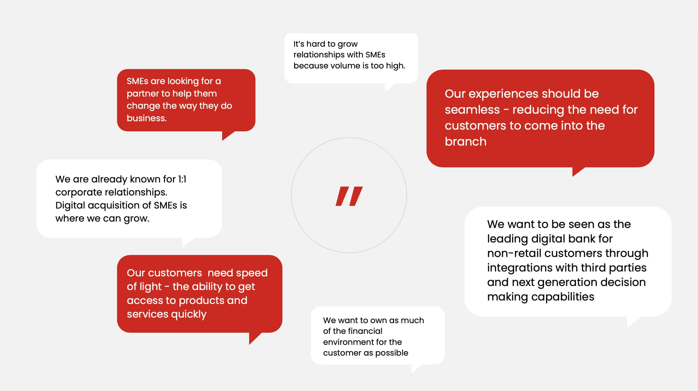
To understand the business ambition and key priorities for non-consumer digital transformation, we talked with Akbank’s stakeholders. This uncovered deeper customer challenges and opportunities to create meaningful moments.
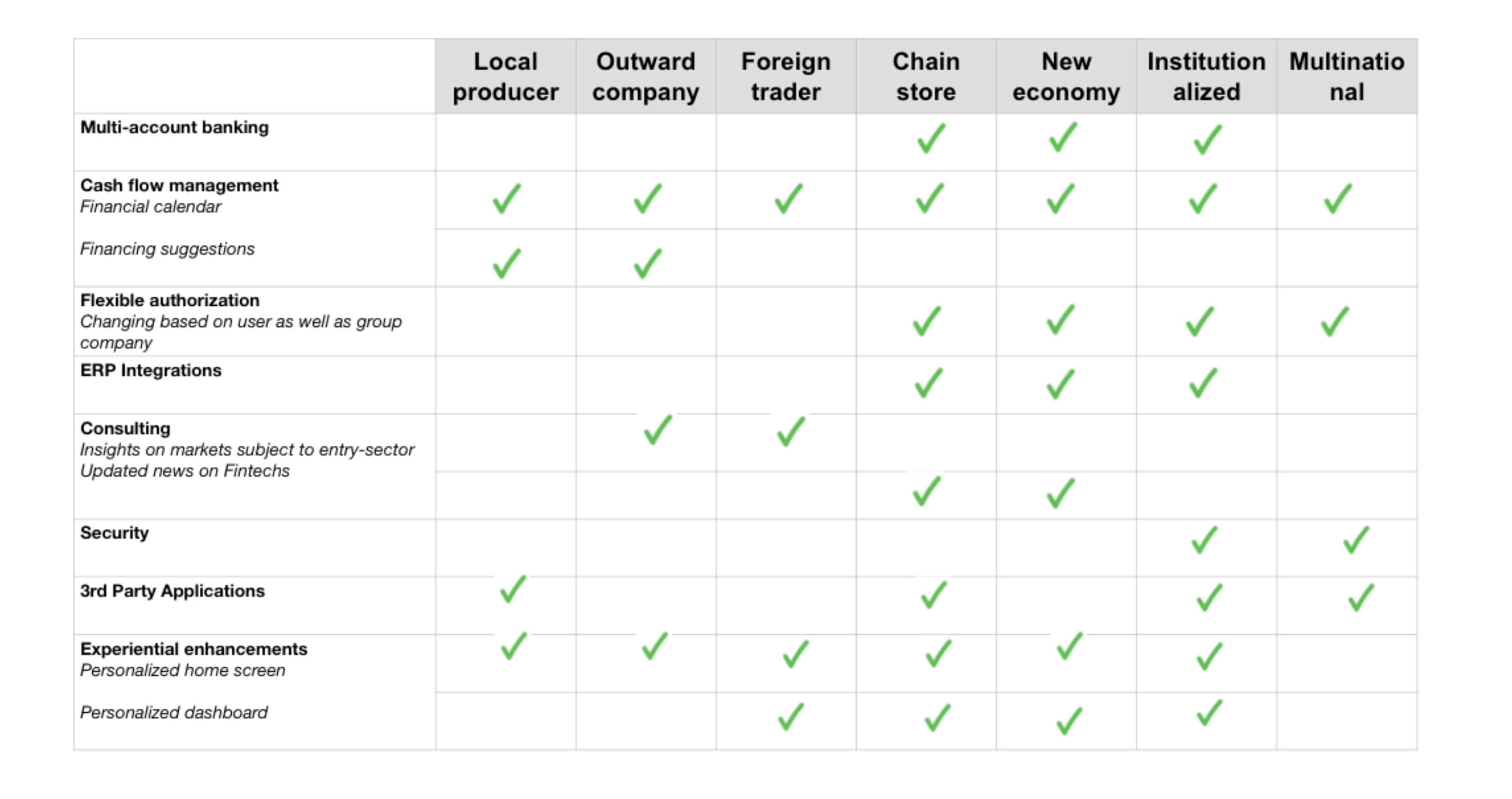
We reviewed personas, ethnography reports, interview scripts, and user stories to understand who the users are, what they need, and what they wish for. From this, we identified relationship manager pain points, needs, and ambitions to address in the designed experience.
We then focused on delivering the right products and services at the right time on the journey, identifying differentiating moments and integrating product bundles and partnerships at appropriate points.

Personas
During the research phase we spent time understanding common themes and needs across all users, prioritising the ones to design for. We created design briefs from the users’ point of view, keeping users in the room while we designed.
Jobs To Be Done
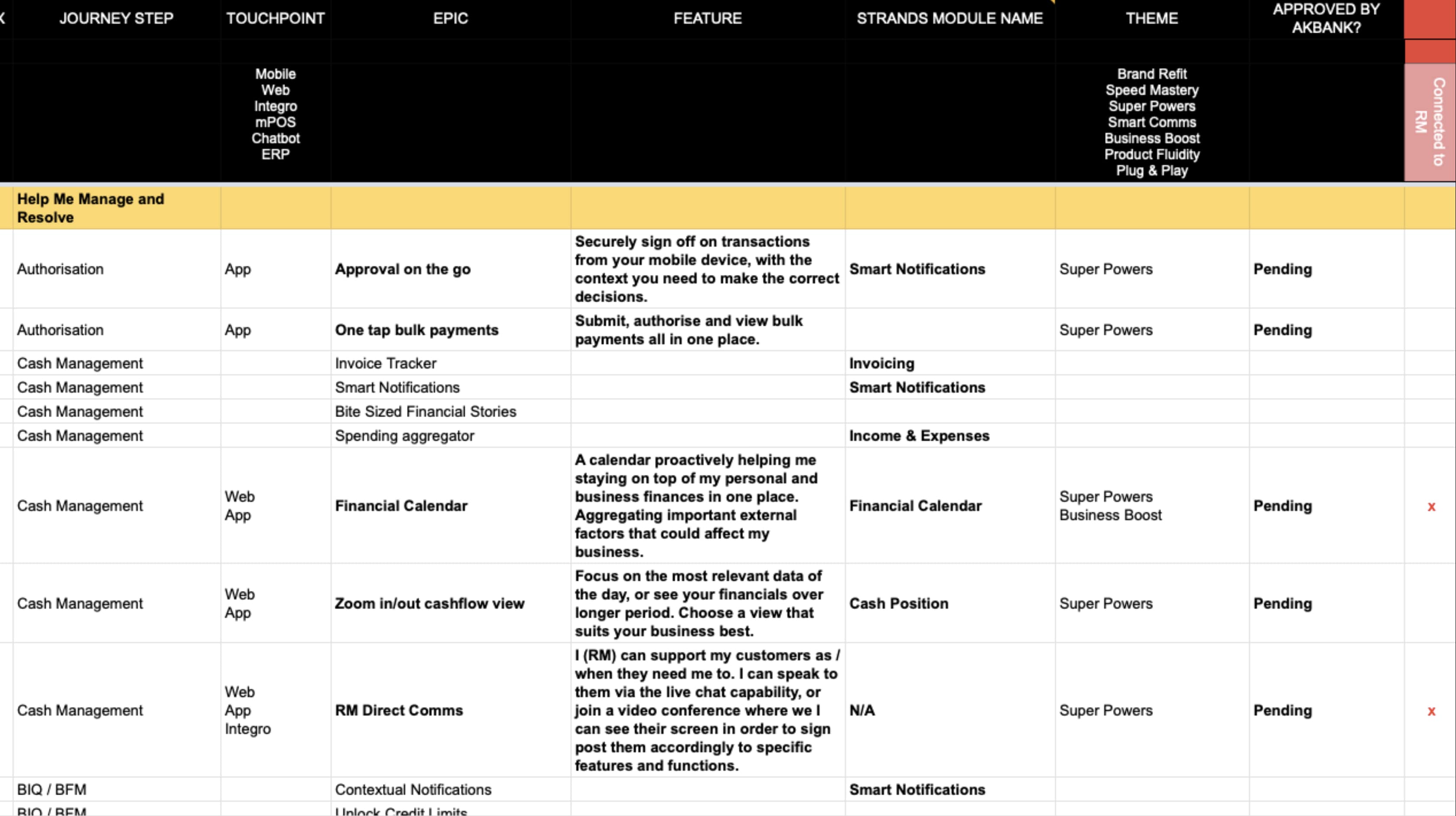
I ran a workshop with the client to create distinct opportunities to make the greatest impact for each persona. Common themes began to emerge as we mapped jobs to customer journeys.
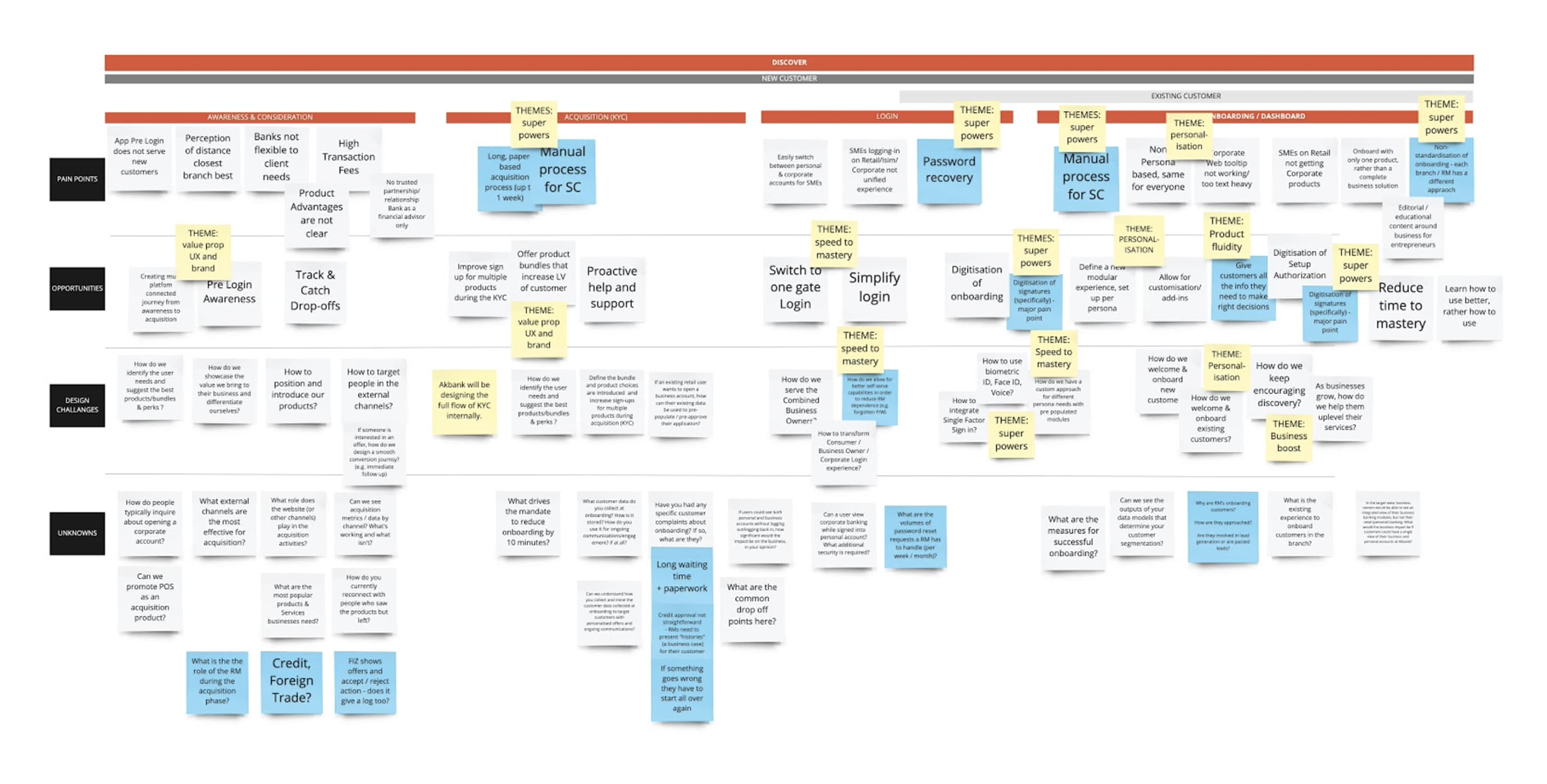
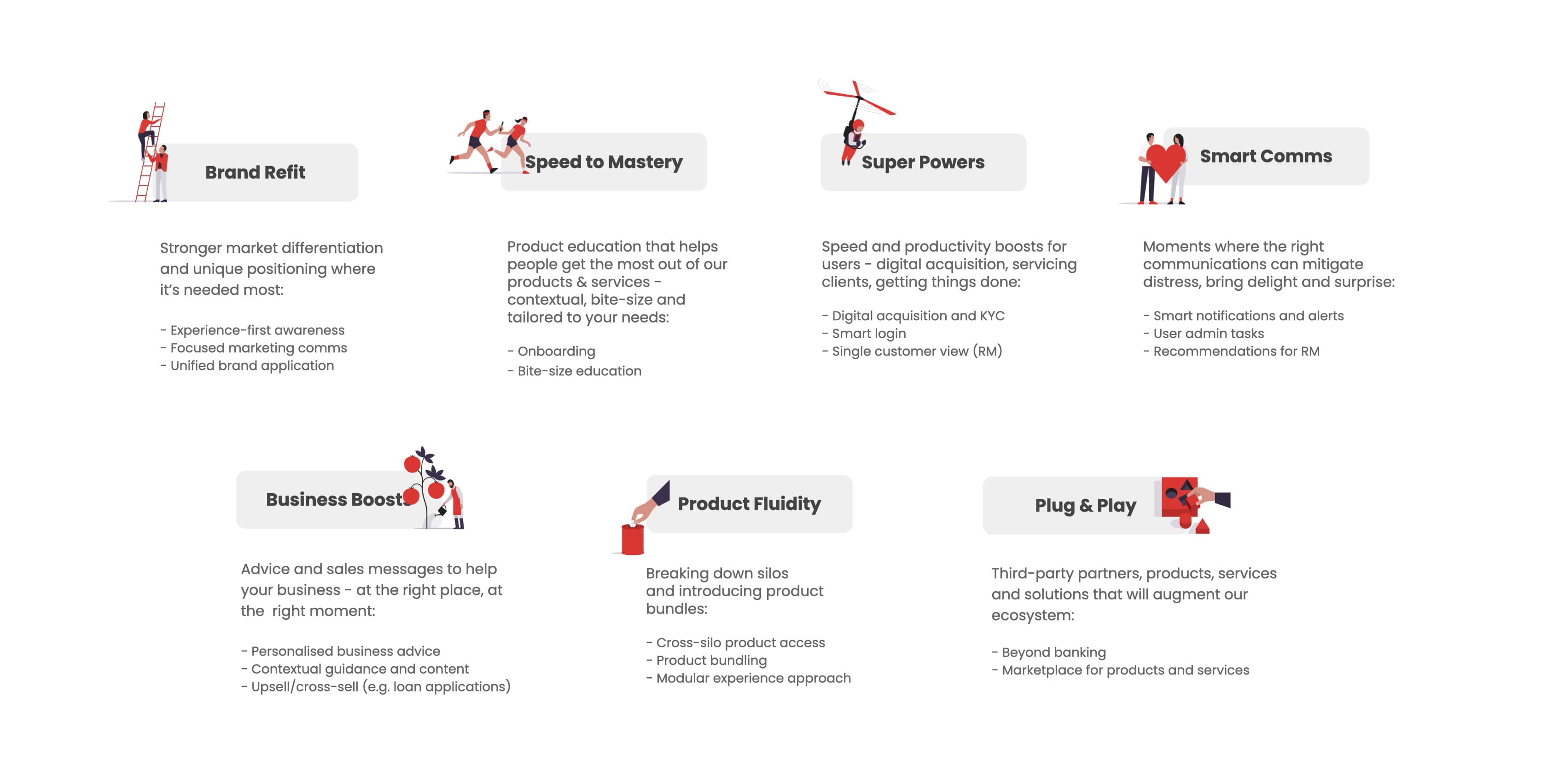
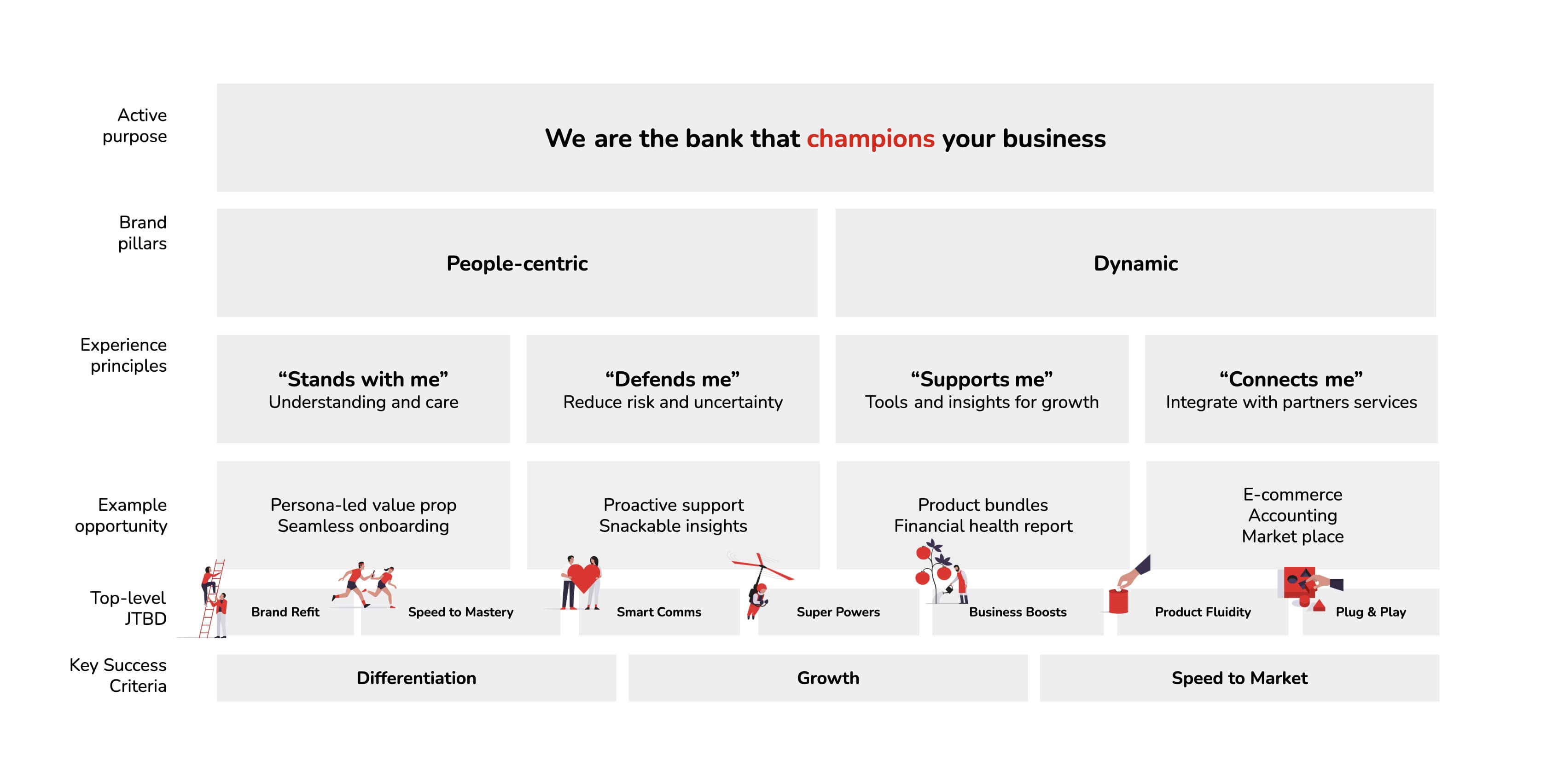
After the workshop, I ideated for each persona, designing for the user first. I mapped customer channel + staff channel implications to create a connected journey.
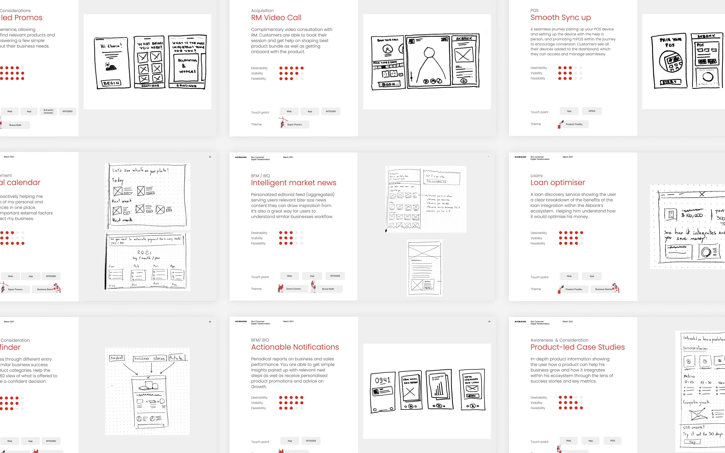
I collaborated with the Akbank core team to prioritise ideas based on desirability, viability, and feasibility, refining the focus areas to ensure the greatest benefit to the business and the customer.
Definition
Golden paths
I created golden paths for each persona, including persona overview, journey steps and storyline, and selected concept screens. This work was the base of the vision for the target state.
Sitemap & navigation
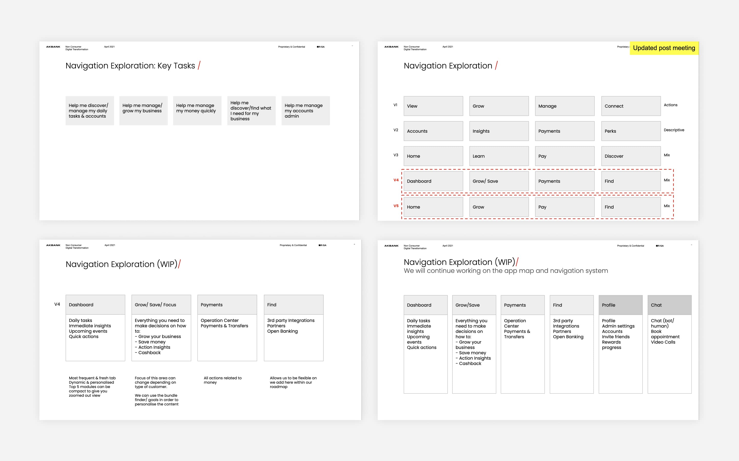
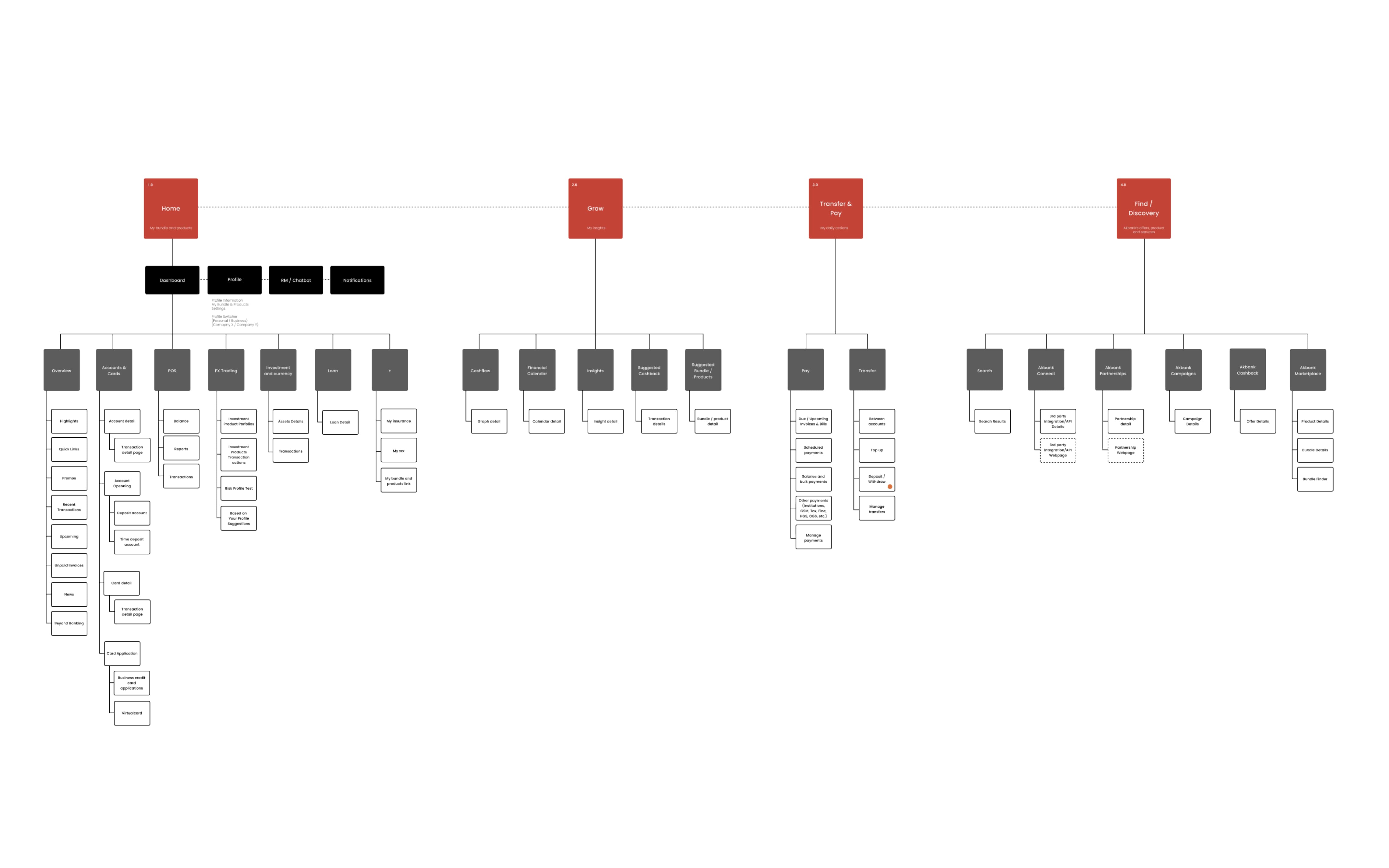
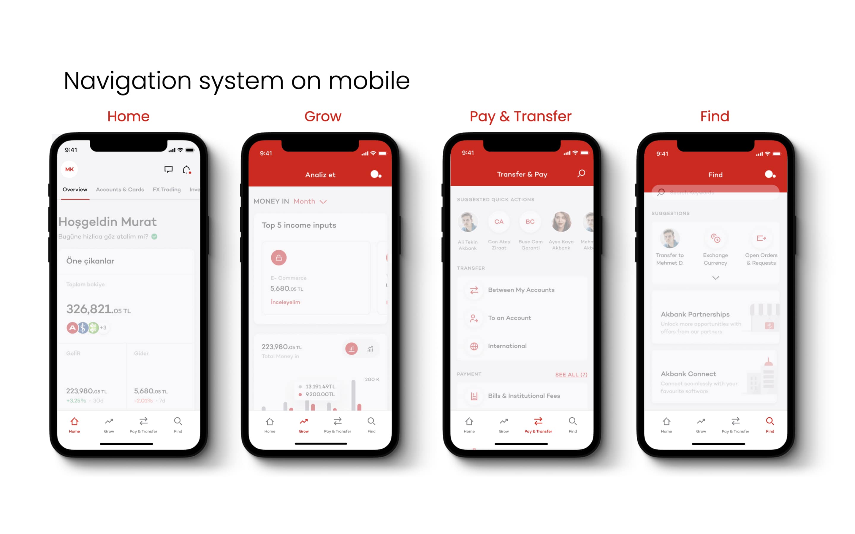
I created a hierarchy content map for the existing app and web experience, and from there built something more dynamic, active, and personal. I reorganized the navigation system around the tasks and responsibilities each persona goes through.
Bundles
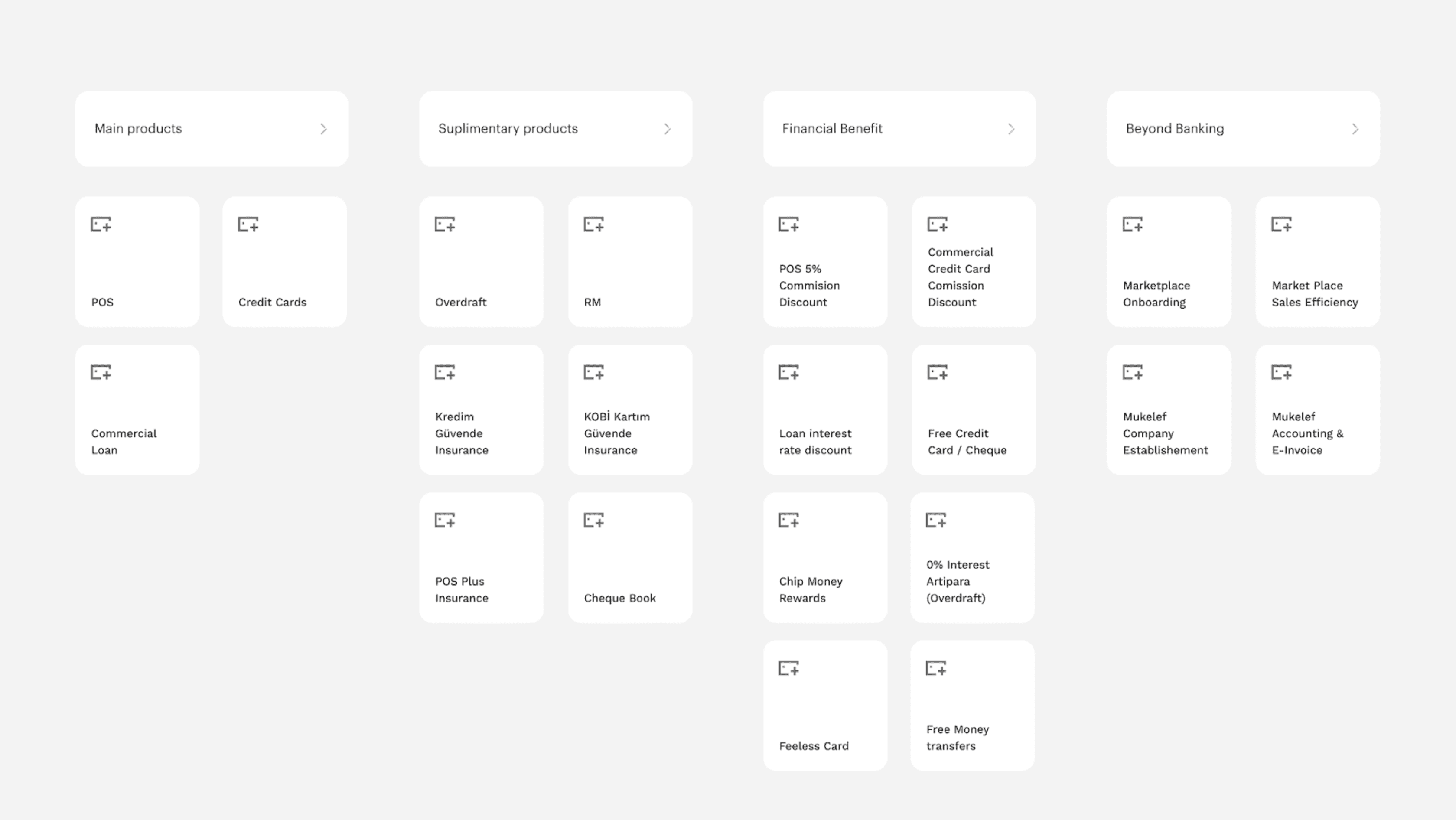
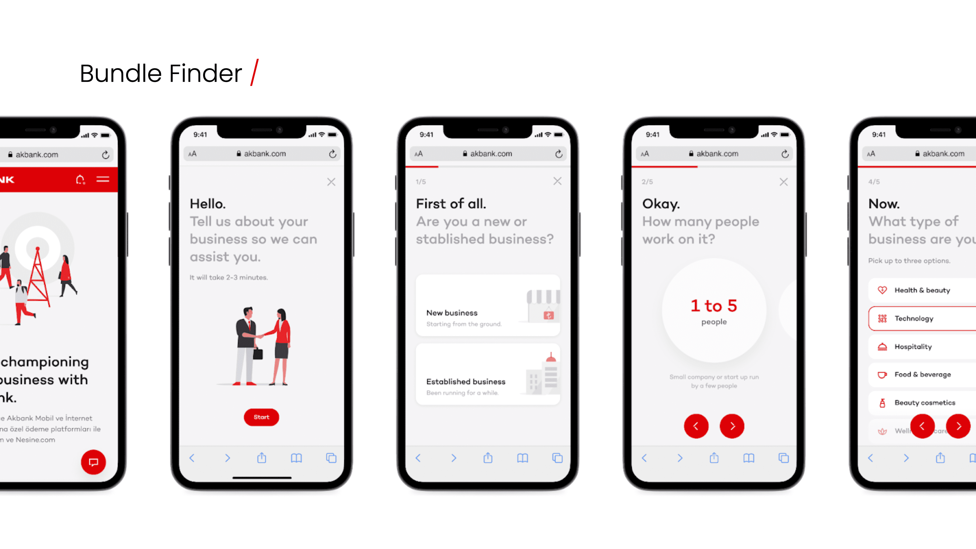
I designed a new bundle logic. Human-centered, simple, and scalable. People should quickly understand bundles through value and cost, have the power to change bundles to fit their business needs, and get recommendations through a guided experience. I designed a questionnaire that helps Akbank understand the customer’s business needs and recommends the right products.
POS and mPOS
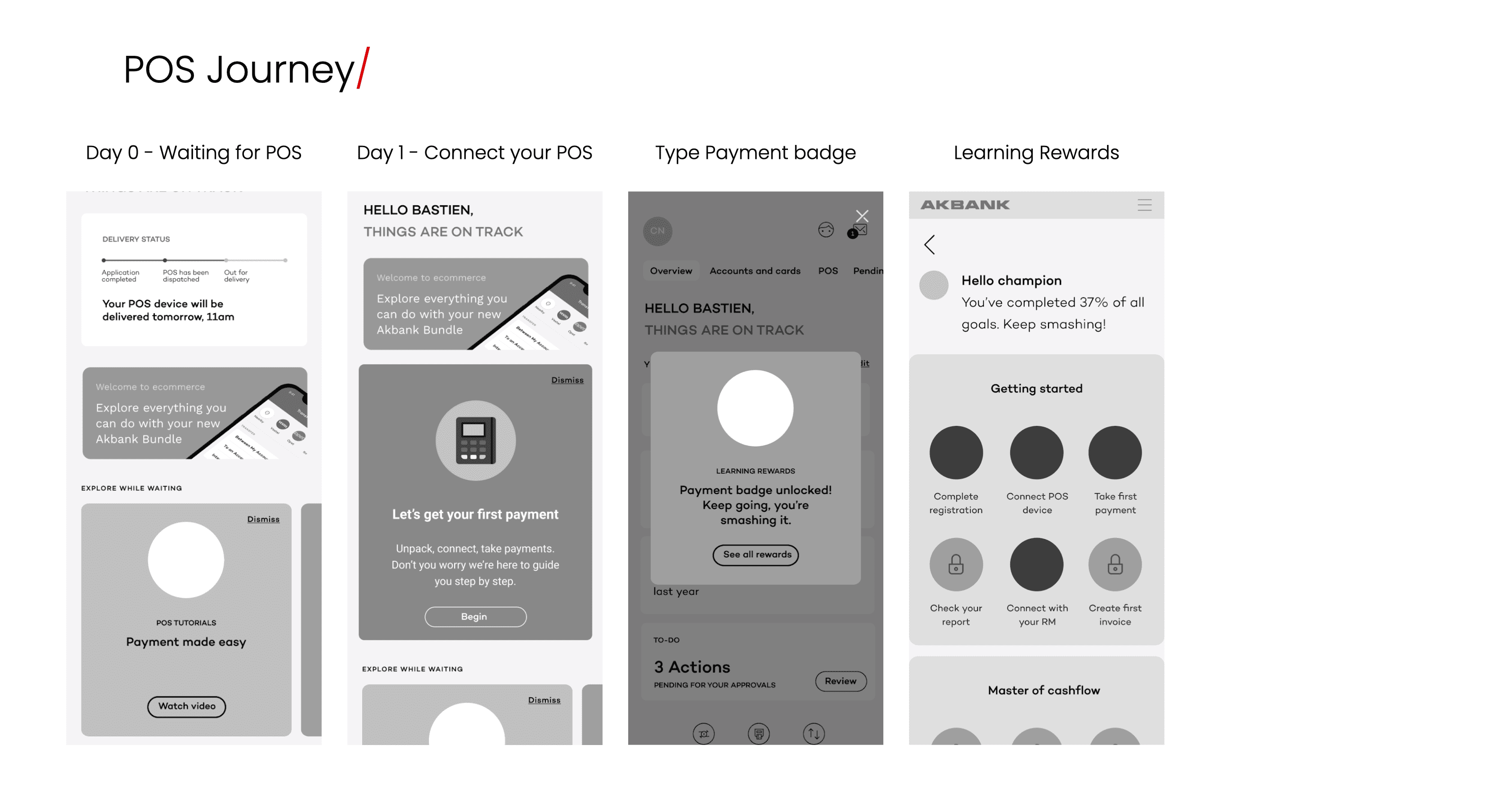
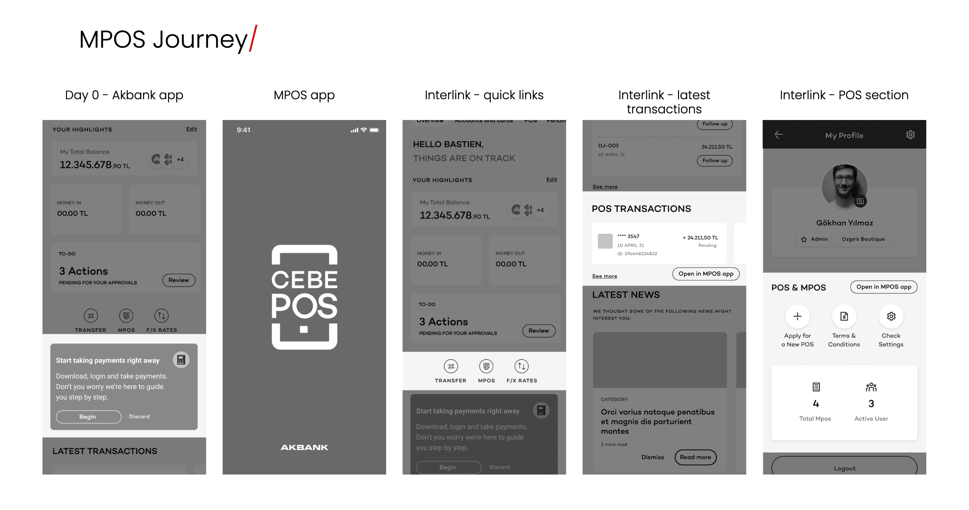
For the POS stream of work, I focused on empowering the user throughout the experience, from enabling them to explore POS while waiting for device delivery to guiding them through their first payment. I implemented a reward system to push them to explore and learn about all the different functionalities.
Dashboard
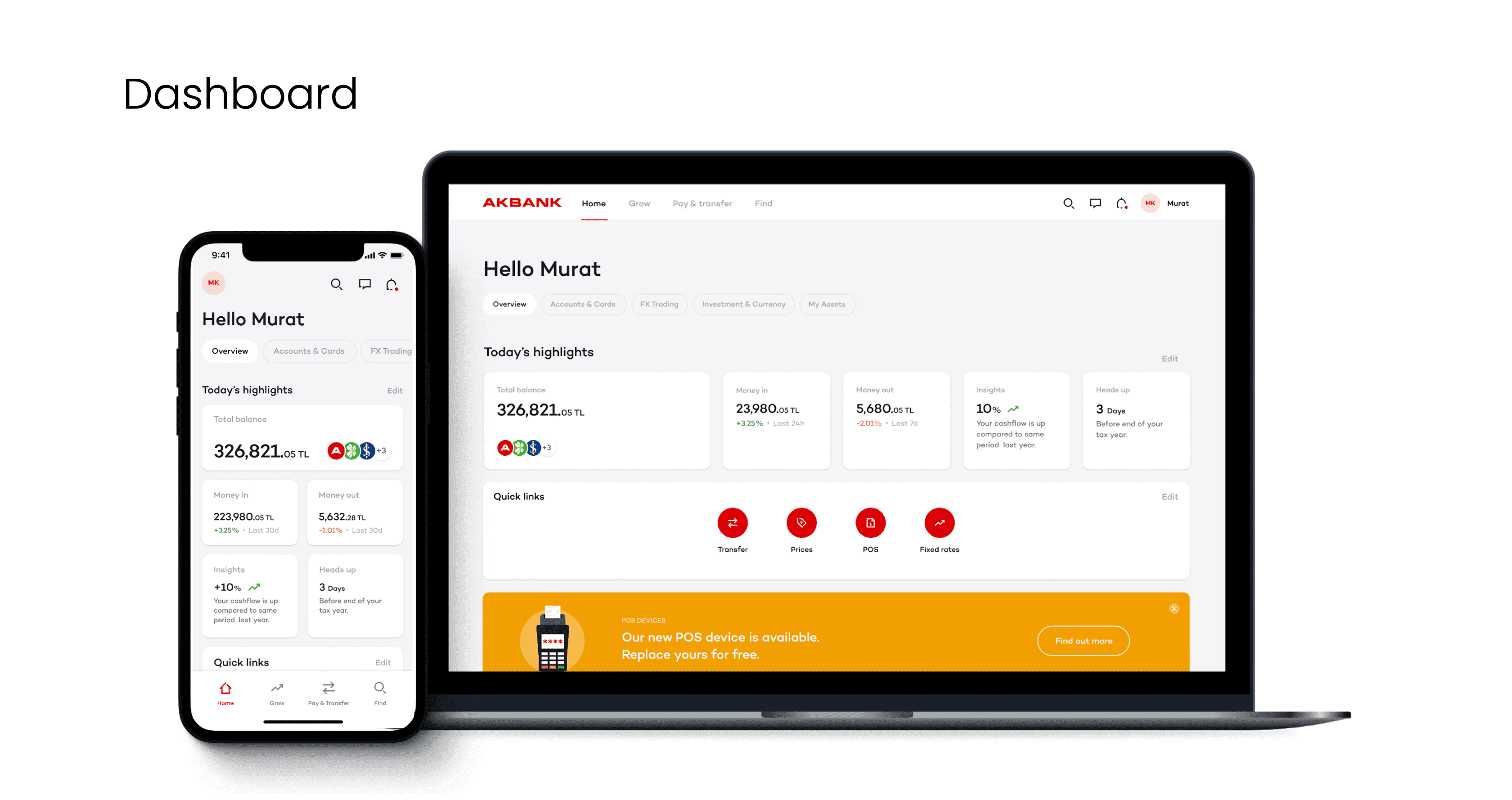
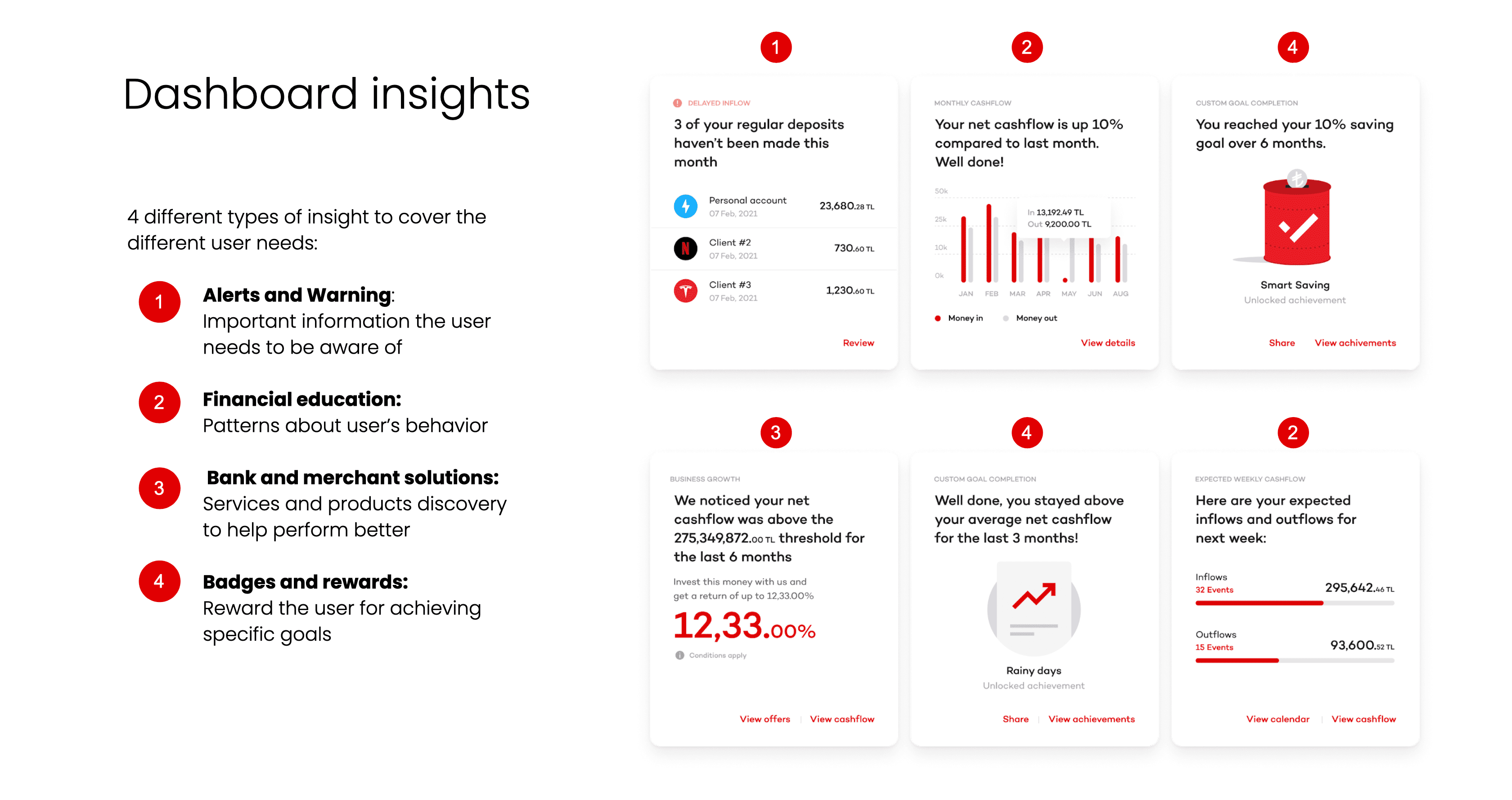
The dashboard offers modules tailored to the user type. It is structured to let the user visualise their company health at a glance on mobile and desktop. Critical modules allow customisation to fully adapt to the user’s need. One of the main strengths is displaying insights through two lenses: general insights about spending, customers, and payments, and contextual insights attached to specific modules giving related tips.
Group company profile
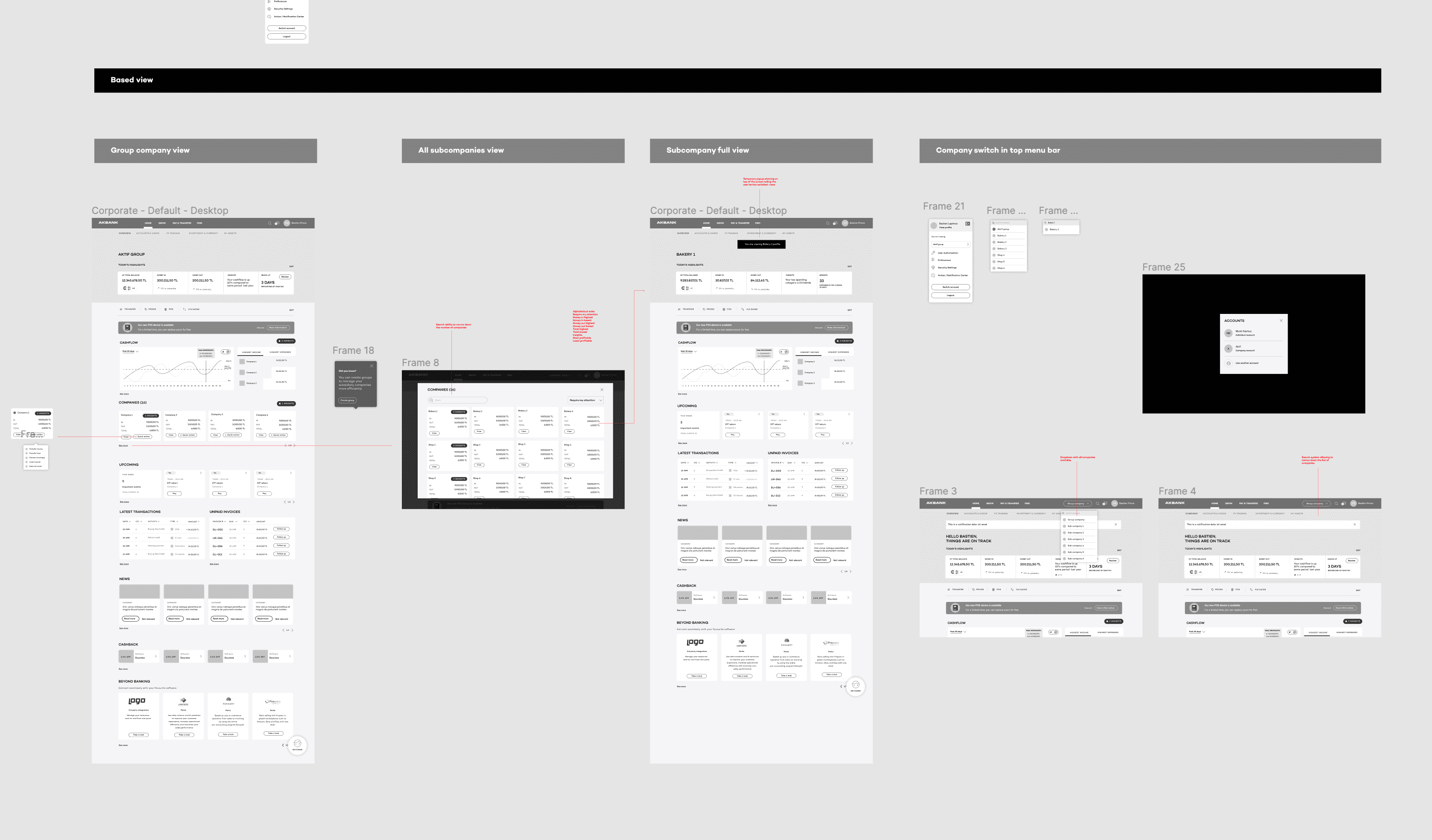
I created a system to let group companies manage their businesses easily, built around a principle of zooming in and zooming out. Going from global group performance to checking the health of individual subsidiaries. I also allowed users to cluster subsidiary companies and track their financial progress through tailored reports.
RM communications
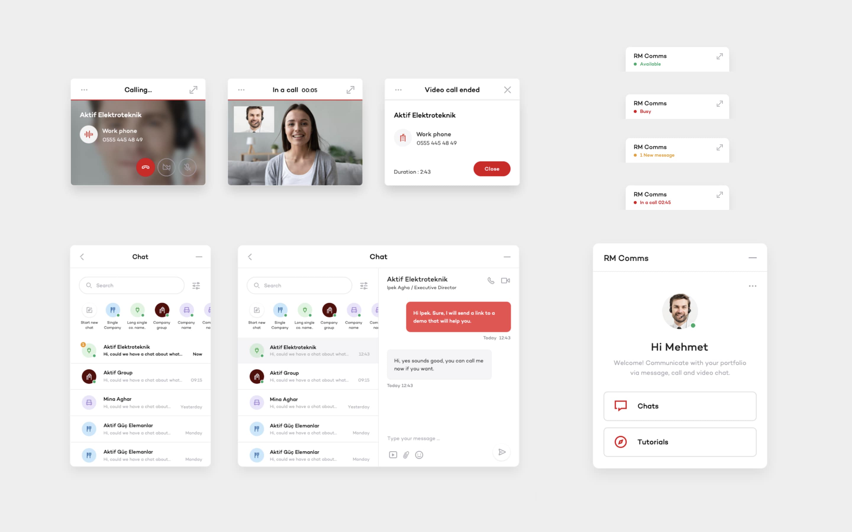
A feature merging existing call centre and chatbot capabilities to serve users in a more meaningful way. The service allows direct connection with a relationship manager, creating a deeper connection through document sharing, video chat, live app demos, and appointment booking.
Validation
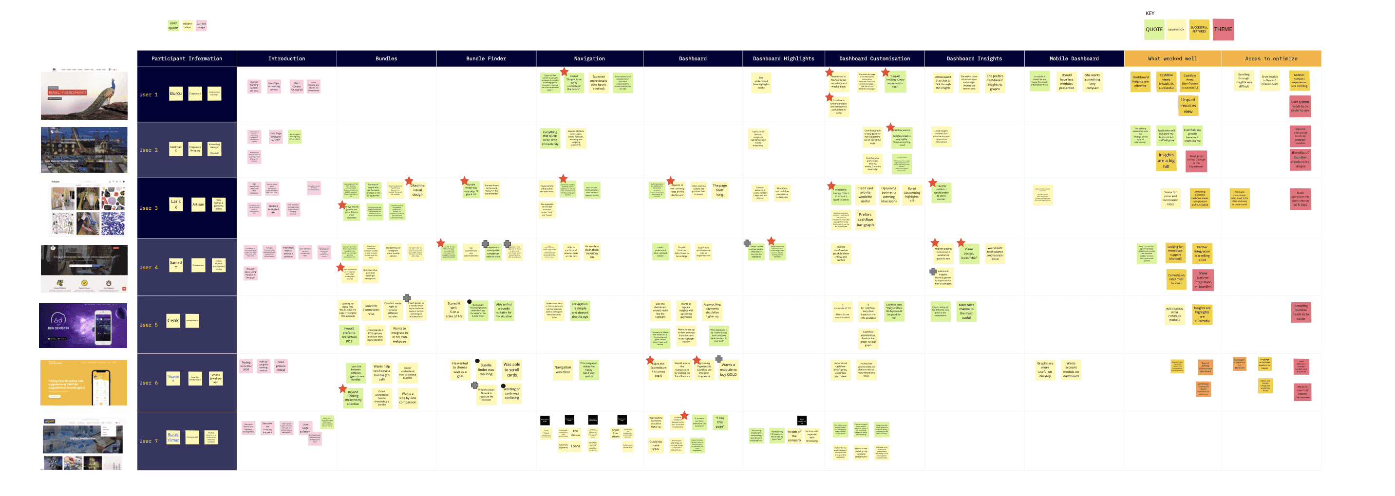
After exploring all key areas, I ran remote user testing with SME and commercial customers as well as relationship managers. The qualitative interviews tested specific areas of the new designs to gather feedback for further iterations. The testing validated the modular dashboard approach, confirmed that the guided bundle experience significantly reduced confusion, and surfaced improvements for the POS onboarding flow.
What I took away
The most useful insight from this project was that the same information architecture can serve radically different user types if the content layer adapts. The dashboard, the navigation, the product catalog were all structurally identical for SME and corporate, but surfacing different depth depending on what the user actually manages.
Jobs To Be Done proved its value here. Rather than designing for demographic personas (small business owner vs. corporate treasurer), designing for jobs (I need to check my cash position, I need to compare subsidiary performance) produced interfaces that scaled naturally across user types.