Anaxago
- Company
- Anaxago
- Team
- Design, Product, Engineering
The product
Anaxago is a French fintech platform that gives private investors access to alternative investment opportunities, including real estate crowdfunding, startup equity, and private equity funds. Founded in 2012, the platform has raised over €850M across 400+ projects from a community of 15,000+ investors.
The platform serves three investment verticals:
Curated property development projects with ticket sizes starting at €1,000. Investors browse opportunities, review due diligence, and invest directly through the platform. Returns are tied to project milestones and exit events.
Access to vetted early-stage and growth-stage companies. Each opportunity comes with a detailed investment thesis, financial projections, and founder profiles. Investors participate through crowd equity rounds or co-investment alongside institutional backers.
Structured investment products managed by Anaxago's team, including SCPI-like vehicles and thematic funds (real estate, innovation, impact). These products offer diversification with lower involvement than direct investments.
The design challenge
Alternative investments are inherently complex. Unlike buying a stock or an ETF, investing in a real estate development or a startup requires understanding project-specific risks, legal structures, expected timelines, and return mechanics that differ for every opportunity. The platform needed to make this complexity navigable for private investors who are not professional fund managers, without oversimplifying the information that experienced investors rely on to make decisions.
The second challenge was trust. Anaxago asks people to commit significant capital to illiquid investments with multi-year horizons. Every design decision had to build confidence: in the platform’s selection process, in the quality of information presented, and in the clarity of what happens after the money is committed.
How I worked
I joined Anaxago to redesign the core investor experience, from opportunity discovery through investment execution to portfolio monitoring. The work touched every surface an investor interacts with.
- Understanding the investor journey We mapped the full investor lifecycle: from first discovery of an opportunity, through due diligence review, investment decision, subscription process, and long-term portfolio monitoring. Each stage has different information needs and different emotional states (curiosity, evaluation, commitment, patience). The design had to support all of them.
- Designing for trust and clarity We established a design language that communicates institutional rigor without feeling cold or inaccessible. Clean data presentation, structured due diligence pages, clear risk indicators, transparent fee structures. The interface had to feel like a serious investment platform, not a marketplace.
- Building the portfolio experience After the investment is made, the user needs to track their portfolio over months and years. We designed the portfolio dashboard to give investors a clear picture of their exposure across asset types, project statuses, and expected returns, unifying real estate, startup, and fund investments in one view.
Key design decisions
Three decisions that shaped the platform.
01Due diligence as a design surface
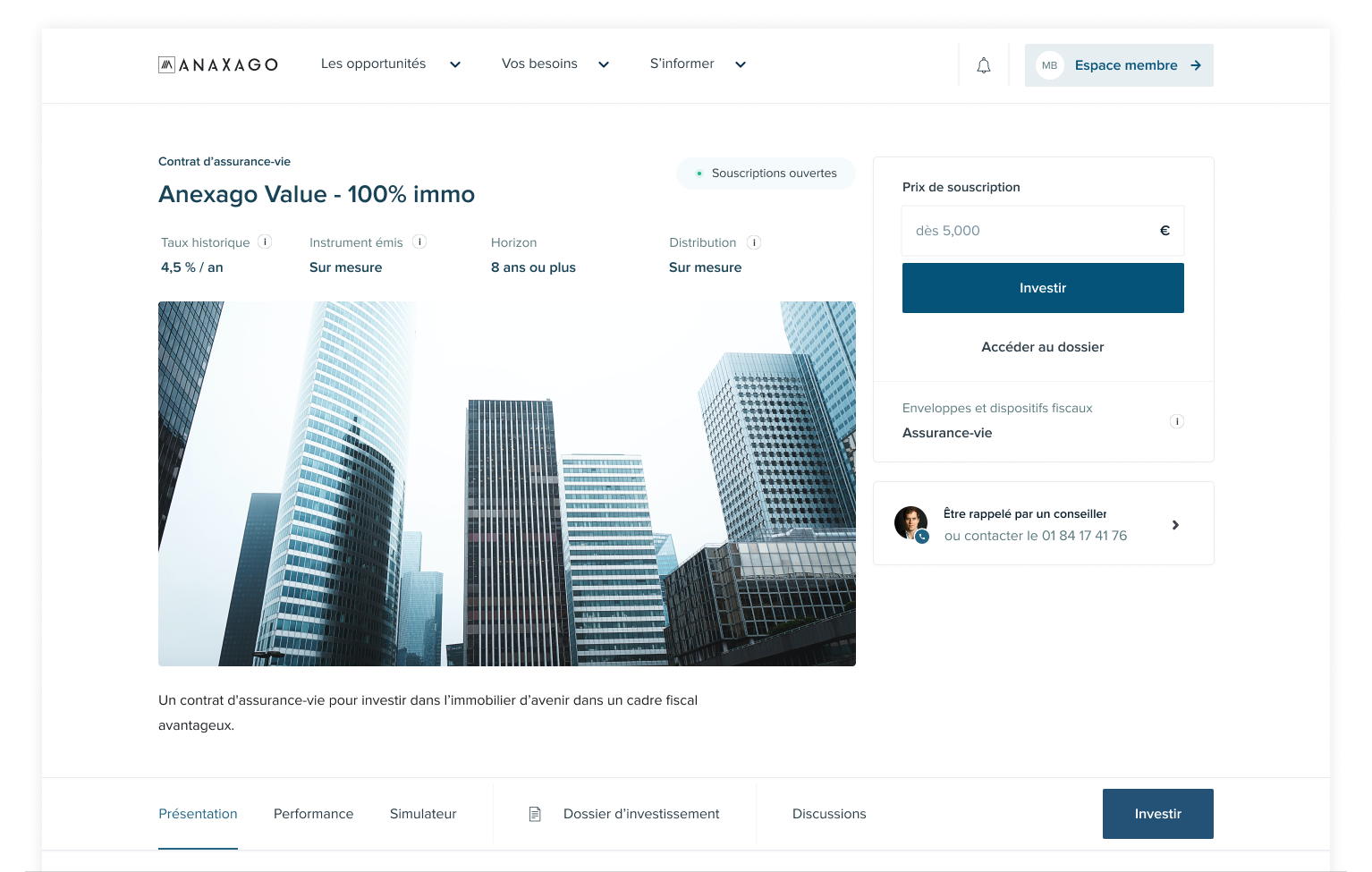
The problem. Investment opportunities arrived as dense documents: financial models, legal structures, market analyses, risk assessments. The existing presentation was a wall of text that overwhelmed new investors and frustrated experienced ones who wanted to quickly assess specific metrics.
What we designed. A structured due diligence page that organizes information in layers. The top level shows the investment thesis, key metrics (target return, timeline, minimum ticket, risk rating), and a clear summary of why Anaxago selected this project. Below, expandable sections cover financials, market context, legal structure, team profiles, and risk analysis in detail. Each section can be consumed independently. The investor can go shallow (quick assessment) or deep (full analysis) on the same page, without navigating away.
The insight. Due diligence is not just information display. It is the primary trust-building surface. The way data is organized, the clarity of risk communication, the transparency of fee structures. All of it shapes whether an investor feels confident enough to commit capital. Treating due diligence as a design problem rather than a content problem was the single most impactful decision.
02A unified portfolio across asset types
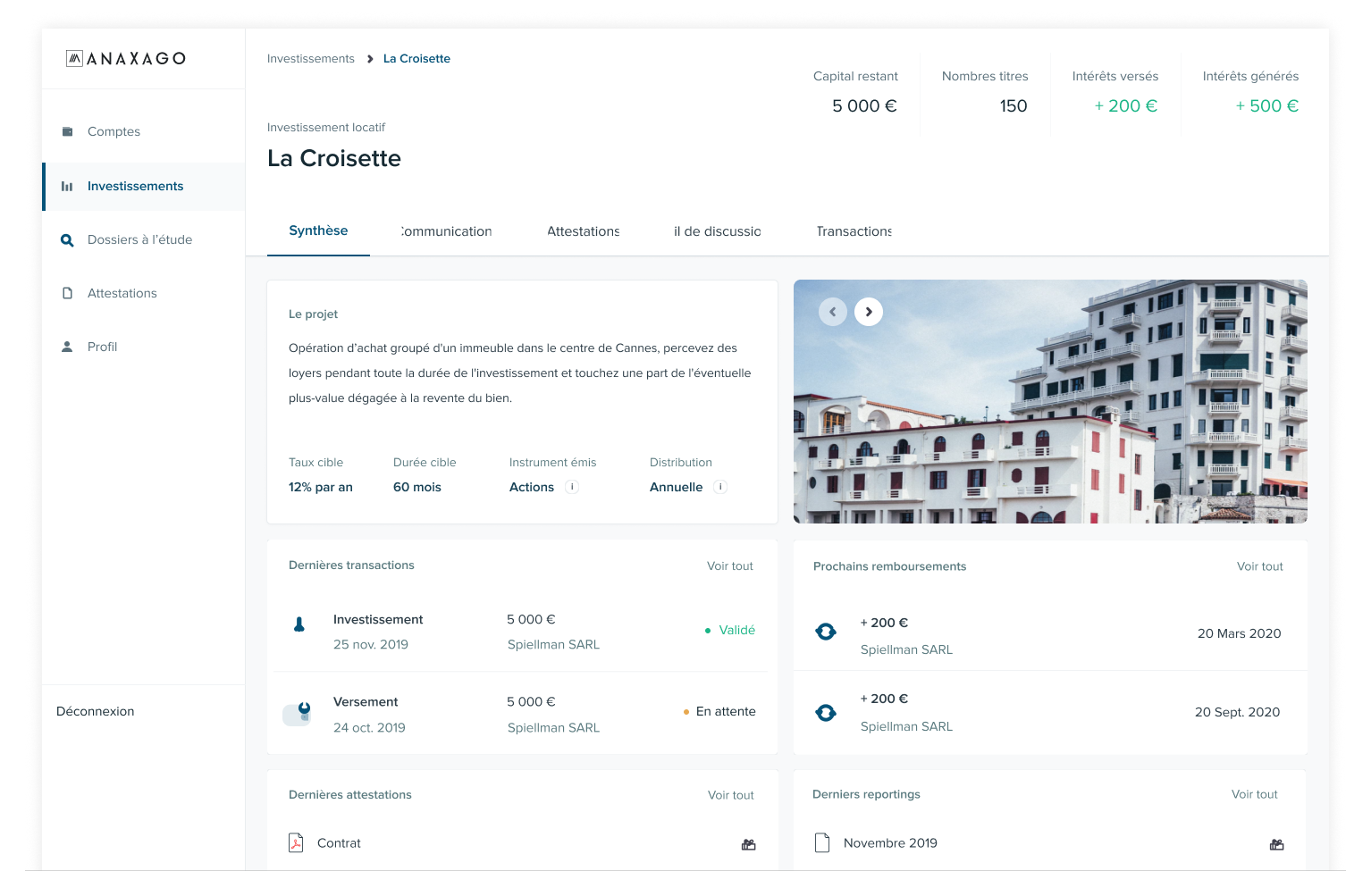
The problem. An Anaxago investor might hold three real estate positions, two startup investments, and a share in a managed fund. Each asset type has different return mechanics (interest payments vs. equity exits vs. fund distributions), different timelines, and different status indicators. Showing them in separate views would fragment the investor’s understanding of their total exposure.
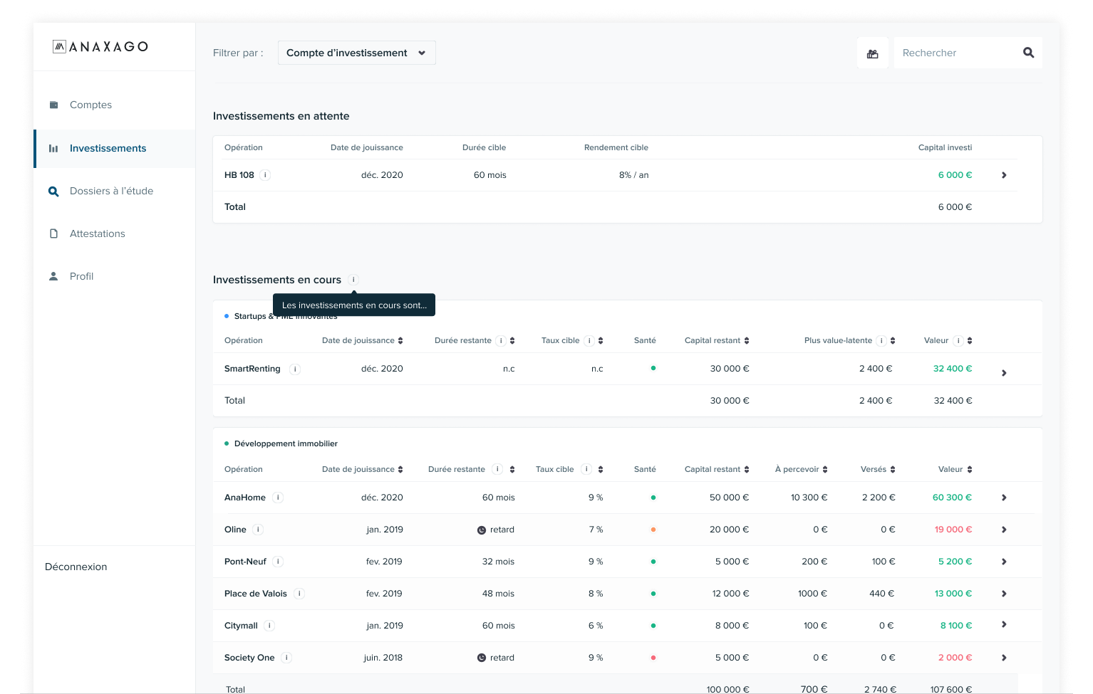
What we designed. A portfolio dashboard that presents all investments in one view, regardless of type. Each investment shows its current status (active, exited, in default), invested amount, expected return, and timeline. The dashboard aggregates total portfolio value, overall return, and diversification across asset types and vintages. Investors can filter by vertical (real estate, startup, fund) but the default view shows everything together, because that is how they think about their money.
03Subscription flow: reducing friction without reducing seriousness
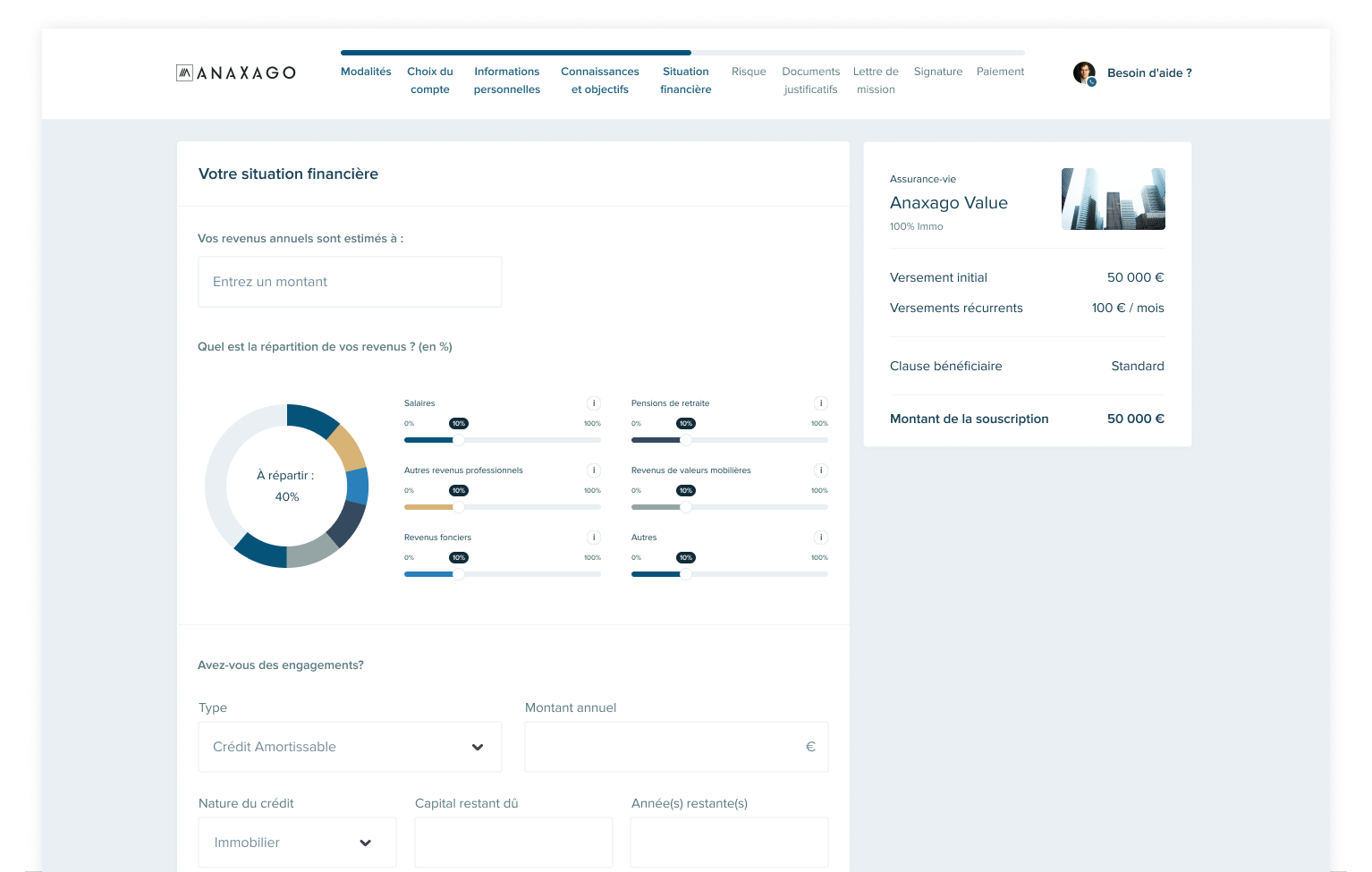
The problem. Investing in alternative assets involves regulatory requirements: KYC verification, suitability assessment, risk acknowledgment, and legal document signing. The existing flow was long, confusing, and caused significant drop-off. But simplifying it too aggressively would undermine the seriousness of the commitment and potentially create compliance issues.
What we designed. A stepped subscription flow that groups requirements by purpose rather than by regulatory category. Step one: confirm your investment amount and understand the key terms. Step two: complete or update your investor profile (KYC, suitability). Step three: review and sign. Each step shows progress and explains why the information is needed. Previously completed profile data is pre-filled but visible for review. The flow feels purposeful rather than bureaucratic, and completable in minutes rather than the previous experience of navigating multiple forms across separate pages.
What I took away
Working on Anaxago reinforced that financial product design is fundamentally about information architecture. The data is the product. How you structure it, layer it, and present it determines whether users can make confident decisions. Every poorly organized page is a reason for an investor to hesitate.
Designing for illiquid, long-horizon investments taught me to think about the entire lifecycle, not just the conversion moment. The portfolio dashboard, the thing the investor sees for years after committing capital, matters as much as the opportunity page that drives the initial investment. Most platforms optimize for acquisition. The ones that retain investors optimize for the post-investment experience.