Siemens
- Company
- Siemens
- Team
- Design, Product, Engineering
The product
Siemens 360° started as a VR player, a 360° immersive experience showing what it is really like to work at Siemens. The goal was to evolve it into something bigger: a content platform called Future Makers that goes beyond virtual reality, delivering diverse content formats that inspire and change perception through a personalized view of Siemens.
The expanded platform needed to support:
- Multiple content formats VR experiences, AR, video, photography, articles, and podcasts, all within a single, unified app architecture.
- Personalization Content tailored to each user’s interests and professional field, with the ability to follow topics, save content, and discover new areas.
- Recruitment bridge A path from passive content consumption to active engagement, including reaching out to people highlighted in content, attending events, and ultimately applying for positions.
The design challenge
The existing app served one purpose well: immersive VR content. Expanding it to handle six different content formats while maintaining a coherent experience was the core challenge. Each format has different interaction needs (a VR experience is consumed differently than a podcast or an article), but the user should never feel like they have switched to a different app.
The second challenge was turning a one-sided content experience into something that encourages action. Siemens ultimately wanted people to apply for jobs. The app needed to make that transition from inspiration to engagement feel organic, not forced.
How I worked
I started by exploring the existing user base and understanding what they were seeking in the app. This revealed two distinct user types with different needs, which shaped the entire product structure.
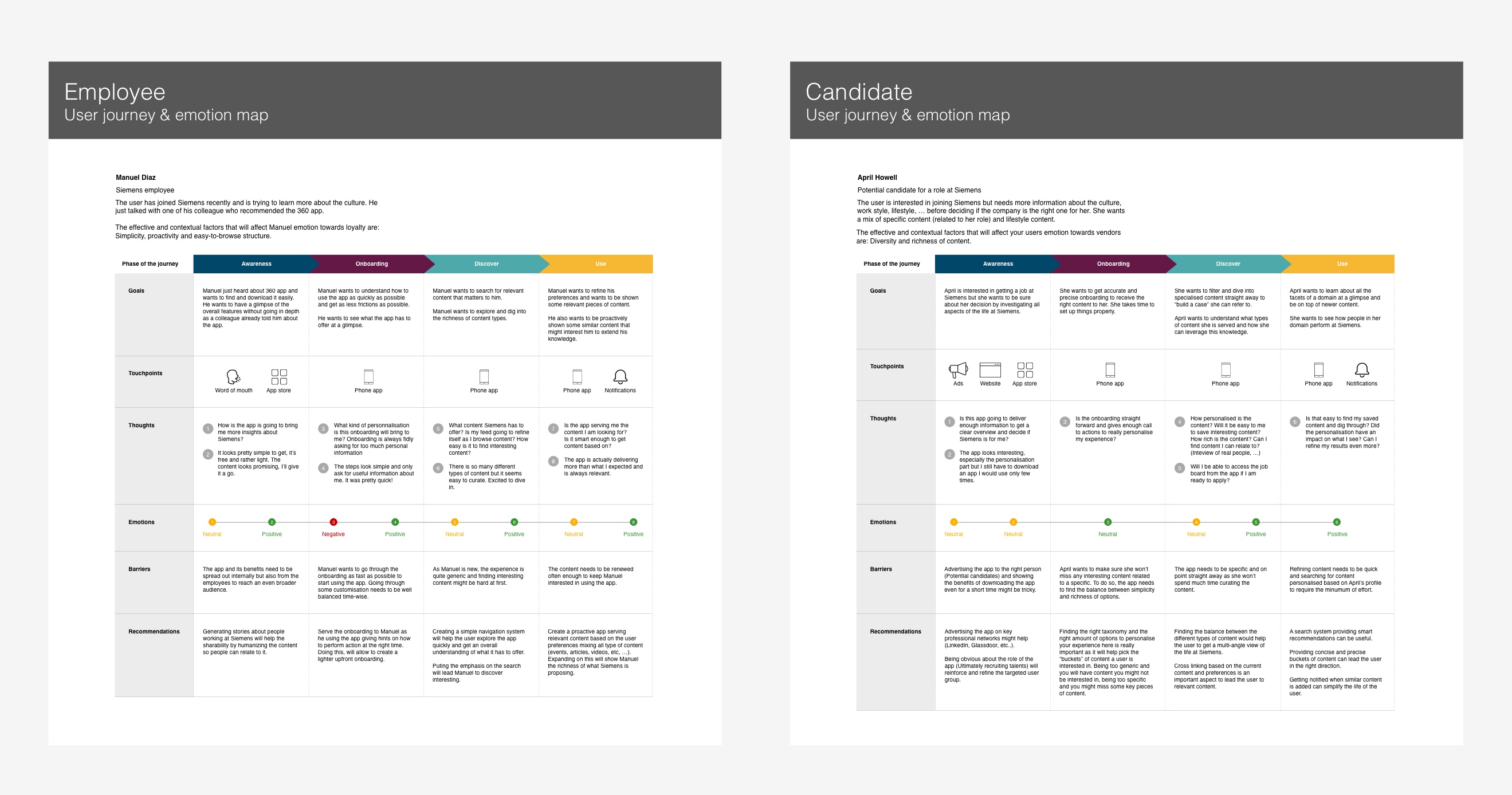
- User research and segmentation We analyzed the existing user base and identified two primary user types: explorers (people curious about Siemens, browsing for inspiration) and seekers (people actively considering Siemens as an employer, looking for specific information about roles and culture). Each type needed a different content delivery strategy.
- Information architecture We divided the overall structure into three parts: onboarding (a one-off flow to capture interests and personalize the experience), container (the persistent structure for browsing, following, searching, and saving), and content (the individual pieces consumed across formats). After onboarding, the user decides how to consume content before engaging with it.
- Content system design We designed a unified content structure that stays consistent across all six formats while bringing in format-specific modules. A VR experience and an article share the same shell (title, description, related content, people, sharing) but each format has its own playback and interaction patterns.
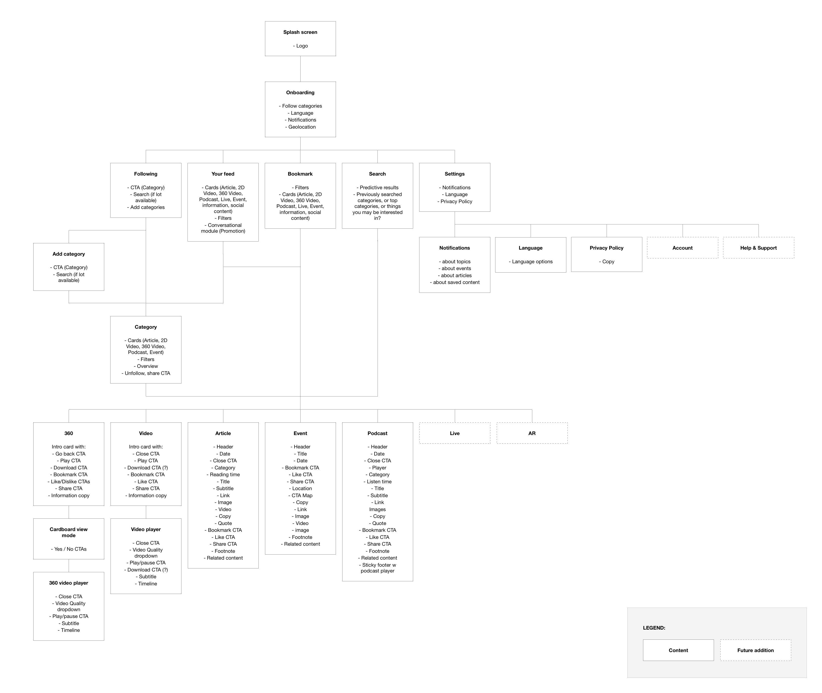
Key design decisions
Three decisions that shaped the platform.
01Five sections with clear purposes
The problem. The existing app had no structure beyond a library of VR content. Adding five more content formats to a flat list would create an unusable experience.
What we designed. Five distinct sections, each built around a specific user intent. Feed for immediate content consumption and sharing. Following for selecting themes that inform the feed. Search for predictive, streamlined exploration. Saved for pinning content for offline or later consumption. Settings for fine-tuning preferences. Each section has one clear purpose, keeping the core concepts (following, searching, saving, discovering) from diluting each other.
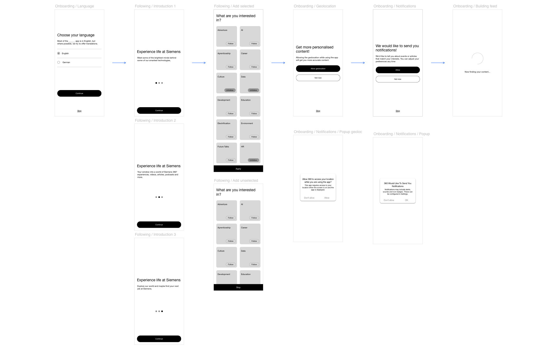
Onboarding. Clear and simple onboarding aiming to create the most bespoke experience possible. Every step is easily skippable if irrelevant to the user.
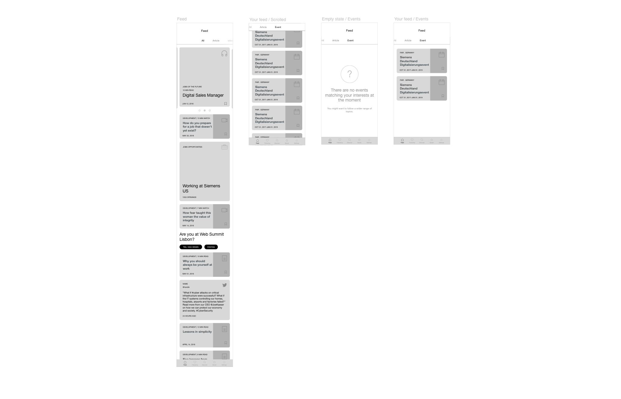
Feed. Quick access to immediately display content and make it shareable straight away.
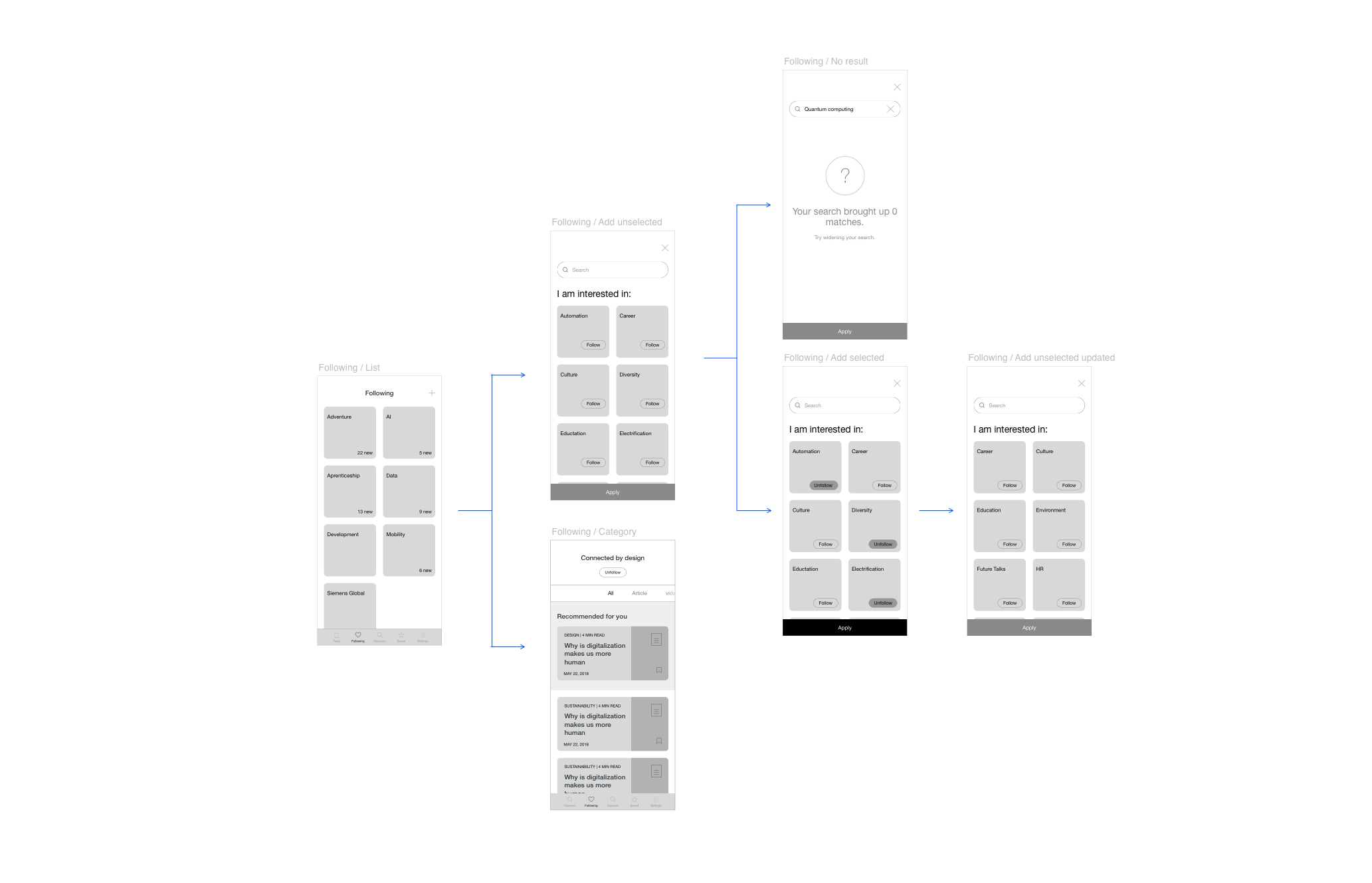
Following. An intuitive selection of themes that inform the feed to serve the right content.
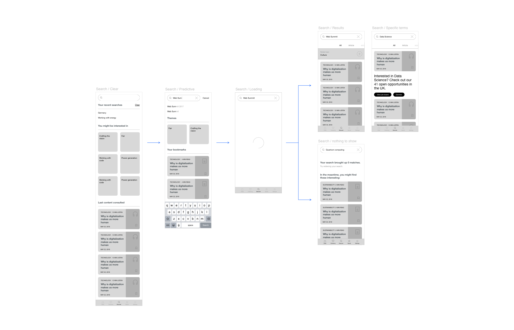
Search. A predictive search engine to streamline the exploration experience.
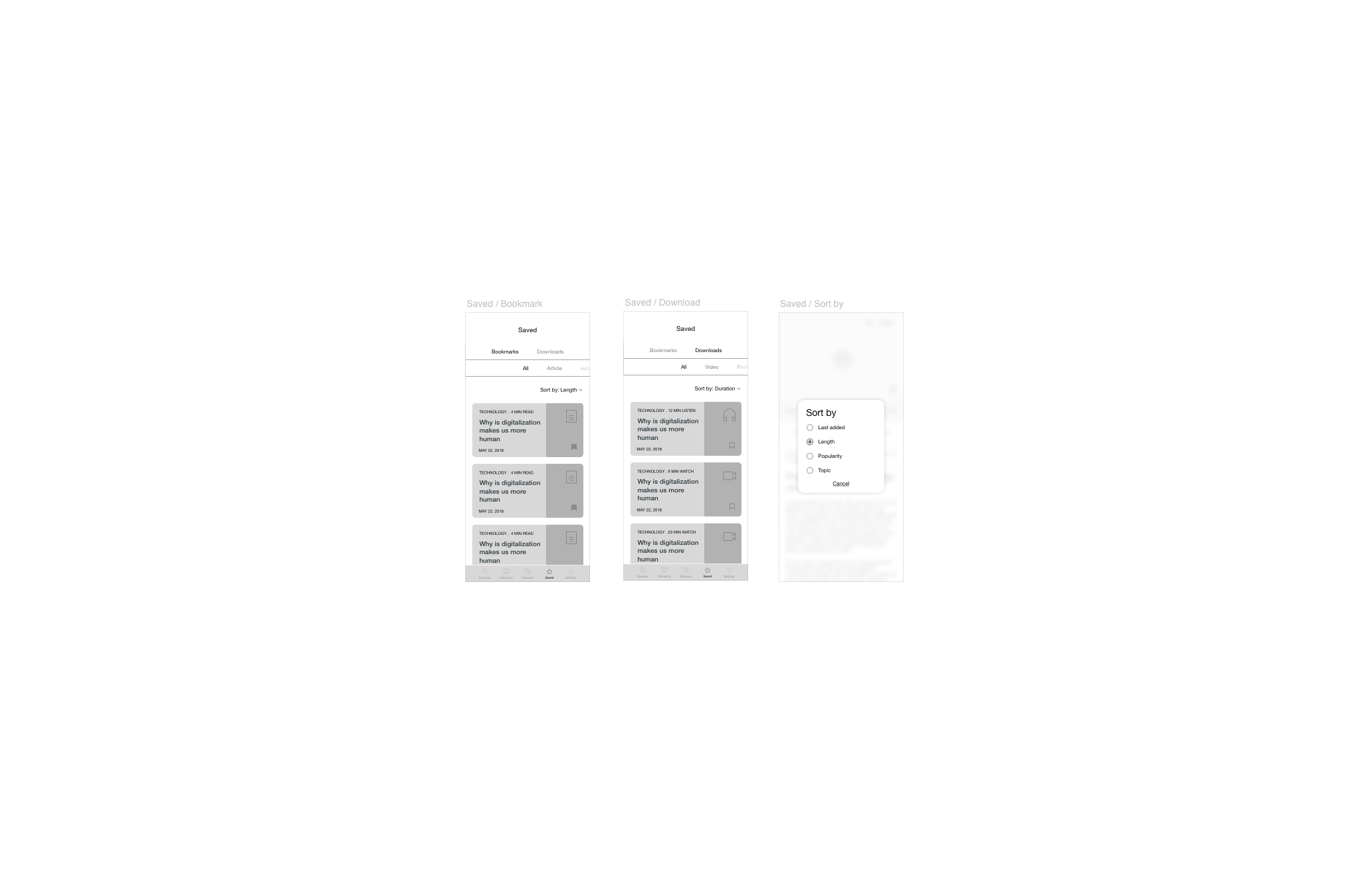
Saved. Pin content and consume it when the user likes, even offline.
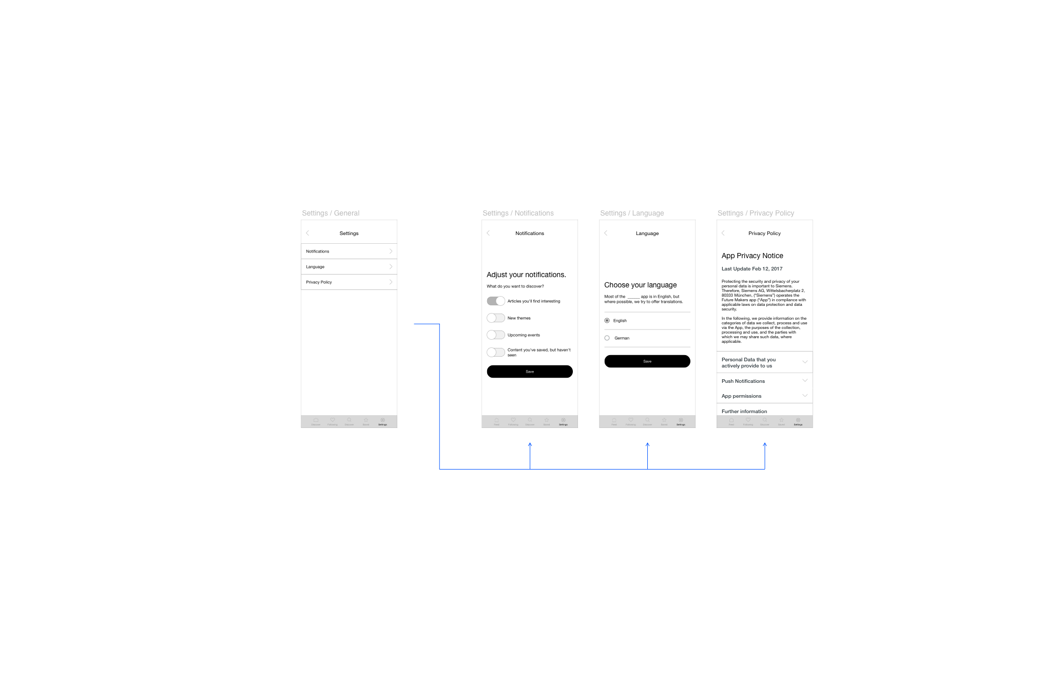
Settings. Fine-tune preferences.
02Content types and unified structure
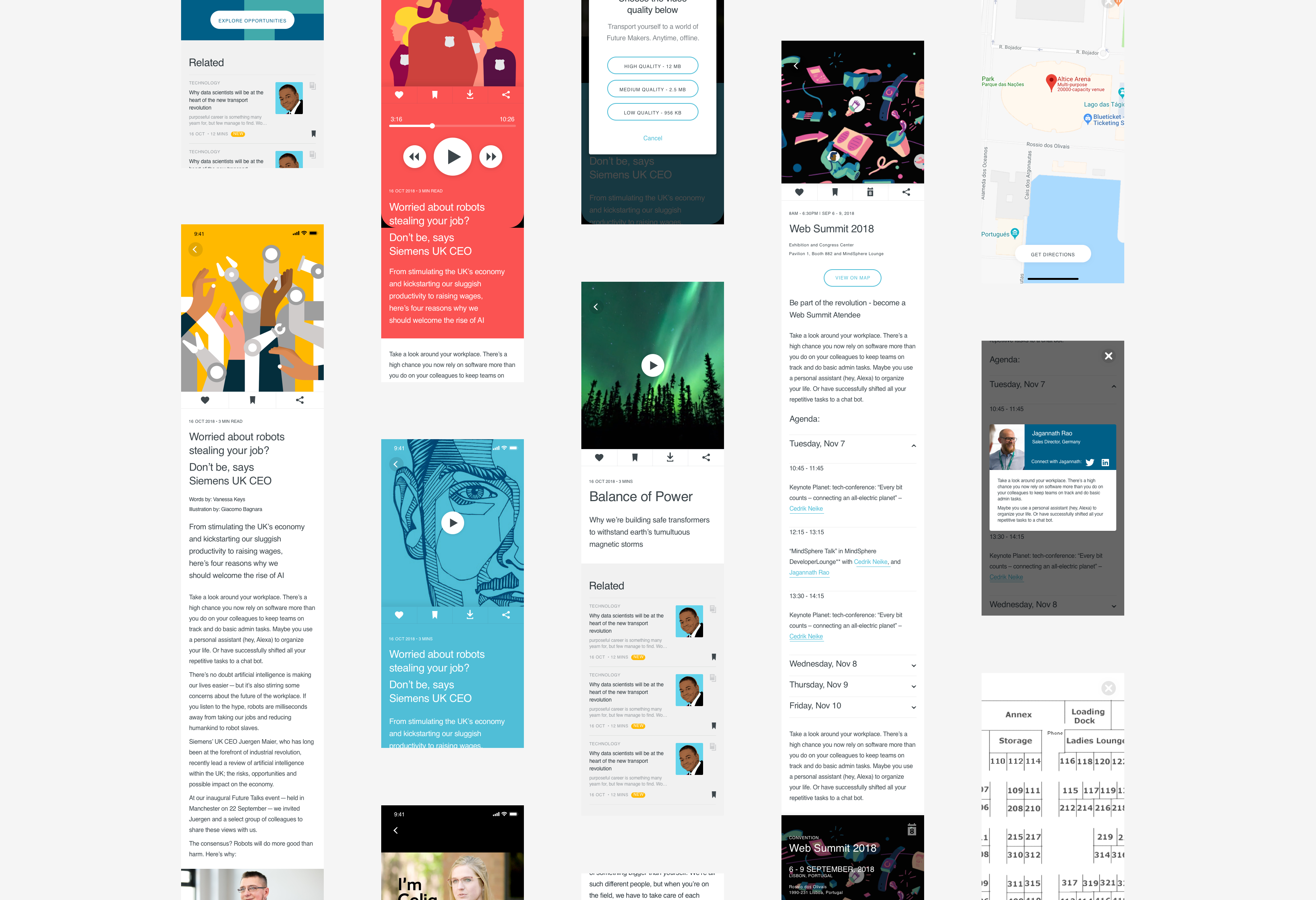
I expanded the content types within the app to create a future-proof and rich platform: VR, AR, video, photos, articles, and podcasts. The overall content structure stays the same to keep consistency and create a recognizable pattern for the user, while different module types suit the different pieces of content.
Throughout the process I kept in mind the ultimate goal of pushing people to apply. To go beyond the one-sided aspect of the app and push users to be more proactive, I made it easy to reach out to people highlighted across all content, attend relevant events, and share more content.
03From inspiration to action
The problem. The app was one-sided. Users consumed content but had no natural path to engage further with Siemens. The gap between watching a VR experience about an engineering role and actually reaching out about that role was entirely on the user.
What I designed. Across all content types, I made it easy to take the next step. People highlighted in content are reachable. Events mentioned in content are attendable. Content is shareable with context. These touchpoints are woven into the content experience, not bolted on as a separate recruitment section. The user moves from passive consumption to active engagement through natural interaction points, not calls to action.
What I took away
The key insight from this project was that the content structure matters more than the individual formats. By designing a shared shell that adapts to different content types rather than building separate experiences for each format, we created something that could grow without fragmenting.
Giving a human face to a company as large as Siemens is not easy. The organic approach worked well here. Rather than siloing users into exploring one area, we encouraged them to discover across fields. This creates a more holistic view of the company and mirrors how people actually build interest in an employer.