the hoxton
UX/Prototyping . Work in progress
the hoxton (www.thehoxton.com) wants to create a community with both their lobby and co-working guests with a more seamless, functional and personalised service driving loyalty and engagement.
Create advocacy and a referral network that will drive incremental room bookings.
The co-working space market is crowded, and the lines are blurring: homes become hotels, hotels become Co-working spaces, Social clubs become Co-working spaces,... To tackle this we focused our attention on the idea of "Open house culture", breadth and depth of experiences, content, styles, locations to let the user be himself.
After performing researches and benchmarking we came up with the following approach to the problem:
We put people at the center of the experience.
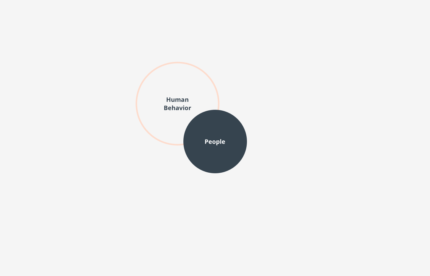
Understanding human needs, expectations and behaviours within the environment.
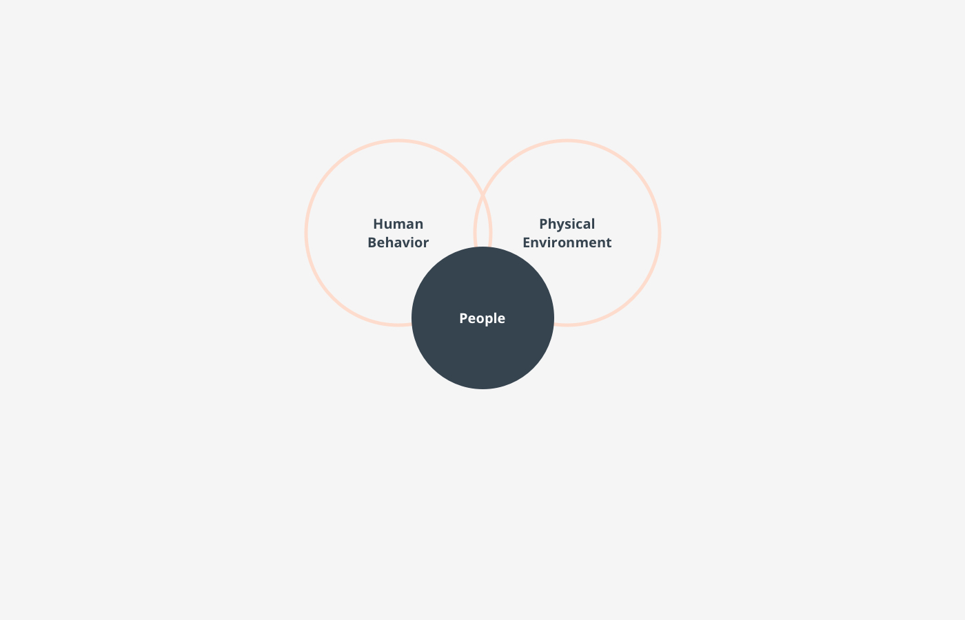
Considering the physical realities of the environment to motivate the right behaviours.
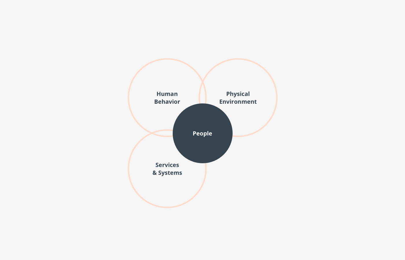
Services providing benefits to Hox tenants, facilities and systems including access pass, bookings, ordering, wayfinding, and partnerships.
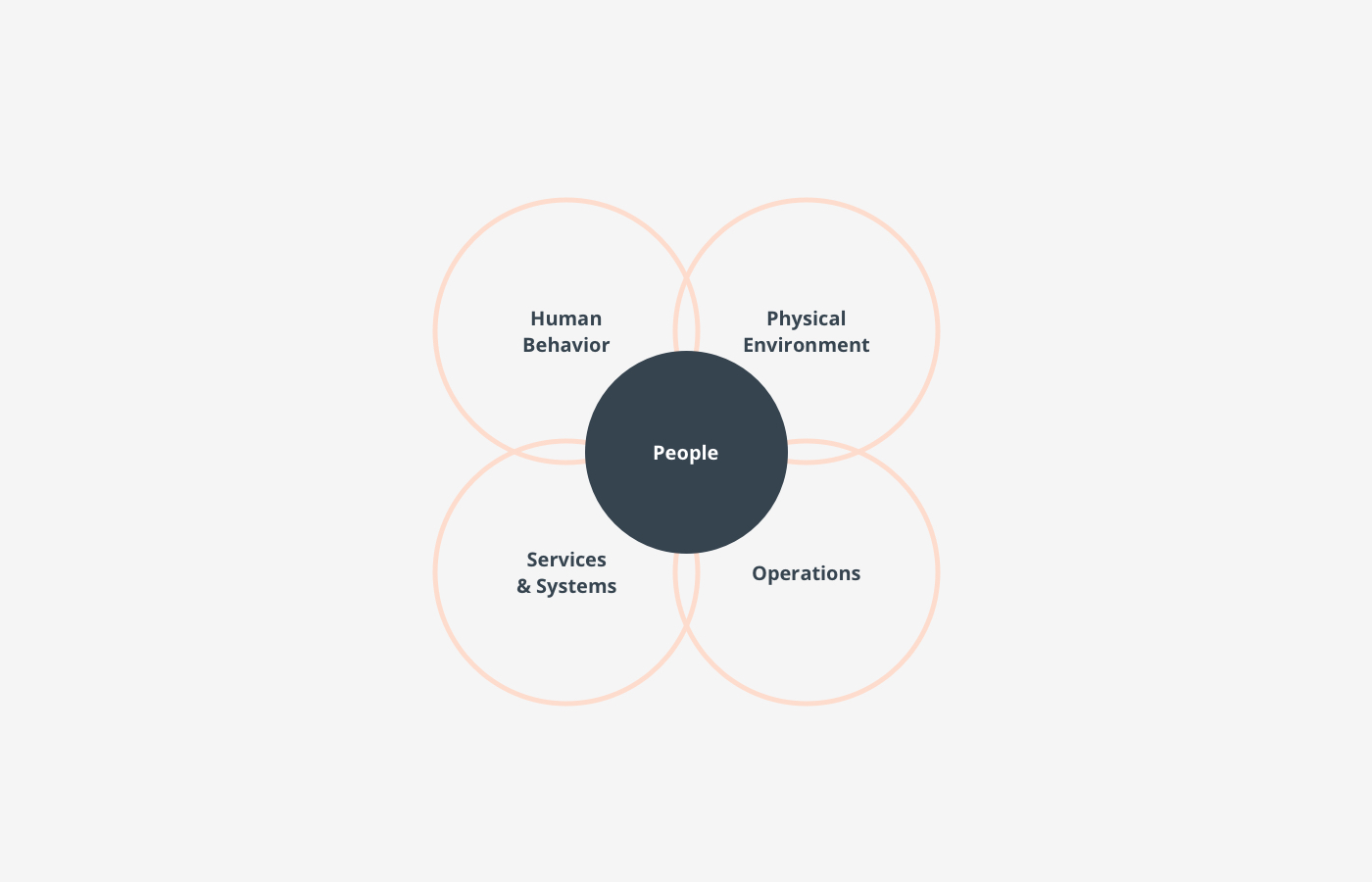
Addressing the efficiency of the space, reporting, sustainability, and monetisation.
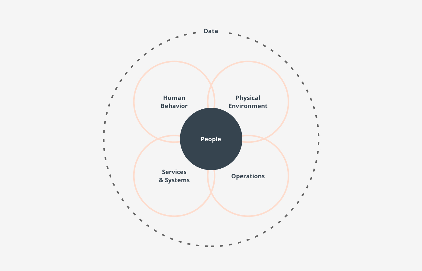
All powered by data to help us understand people and optimise their experience.
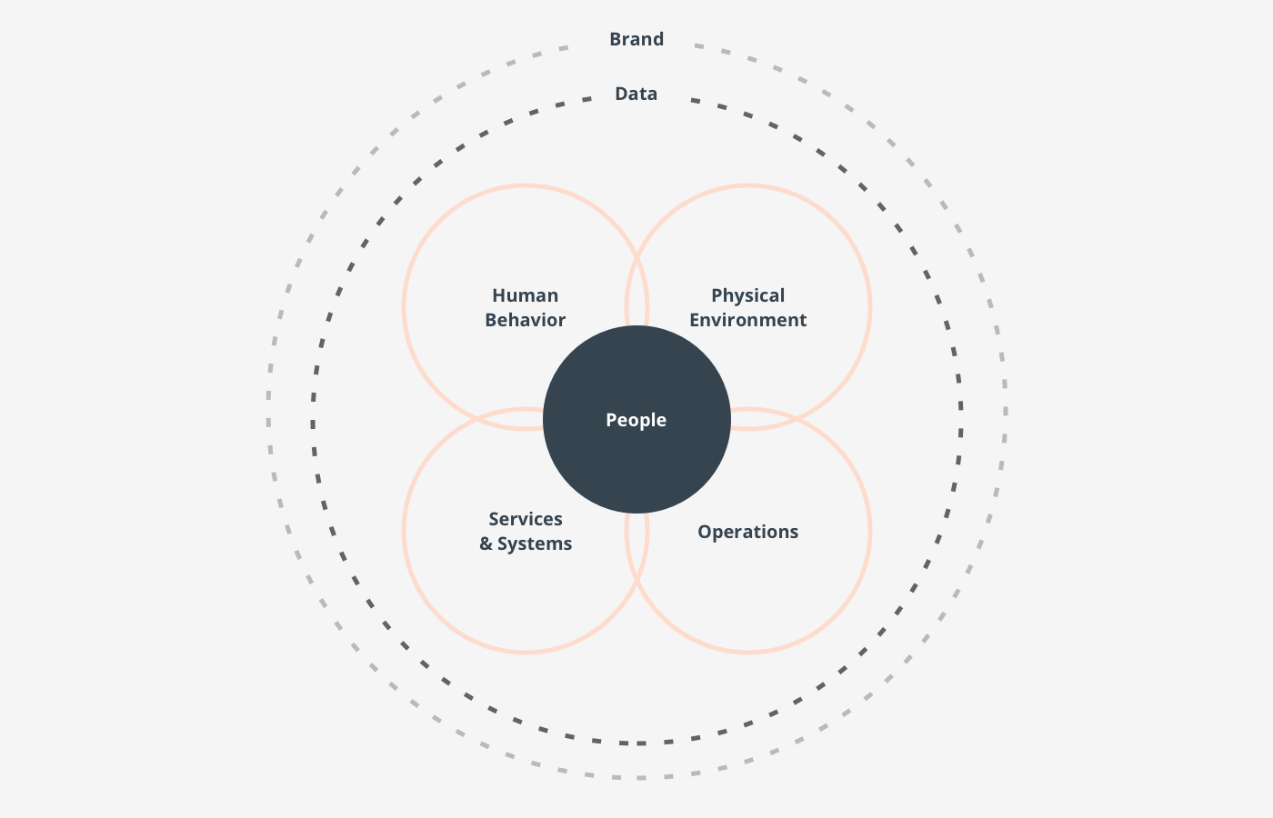
And wrapped in brand purpose. Ensuring Hoxton brand is at the heart of the experience and everything is meaningful to the brand
We focused on 3 core principles to bring this project to life.
SPARK . COMMS
Inspirational elements to bring the outside in and explain the Hoxton new offering
SIMPLIFY . BRAND
Dialogue elements to create a connection and make the experience simple and streamlined
SERVICE . PLATFORM
Functional elements to enable the client to use the space and the brand for their needs
Personas
To deliver the right service we need to understand who will be using the co-working space: the goals, needs and interests of typical users at every possible tier.
We can draw insights from data, primary and secondary research and our observations to create personas.
These insights will help us understand what features and attributes we should prioritize as we develop the co-working space experience.
Audience by intent:
Casual individual
Looking for venues
Looking for individual space
Looking for group space
Businesses that are growing / diversifying / relocating
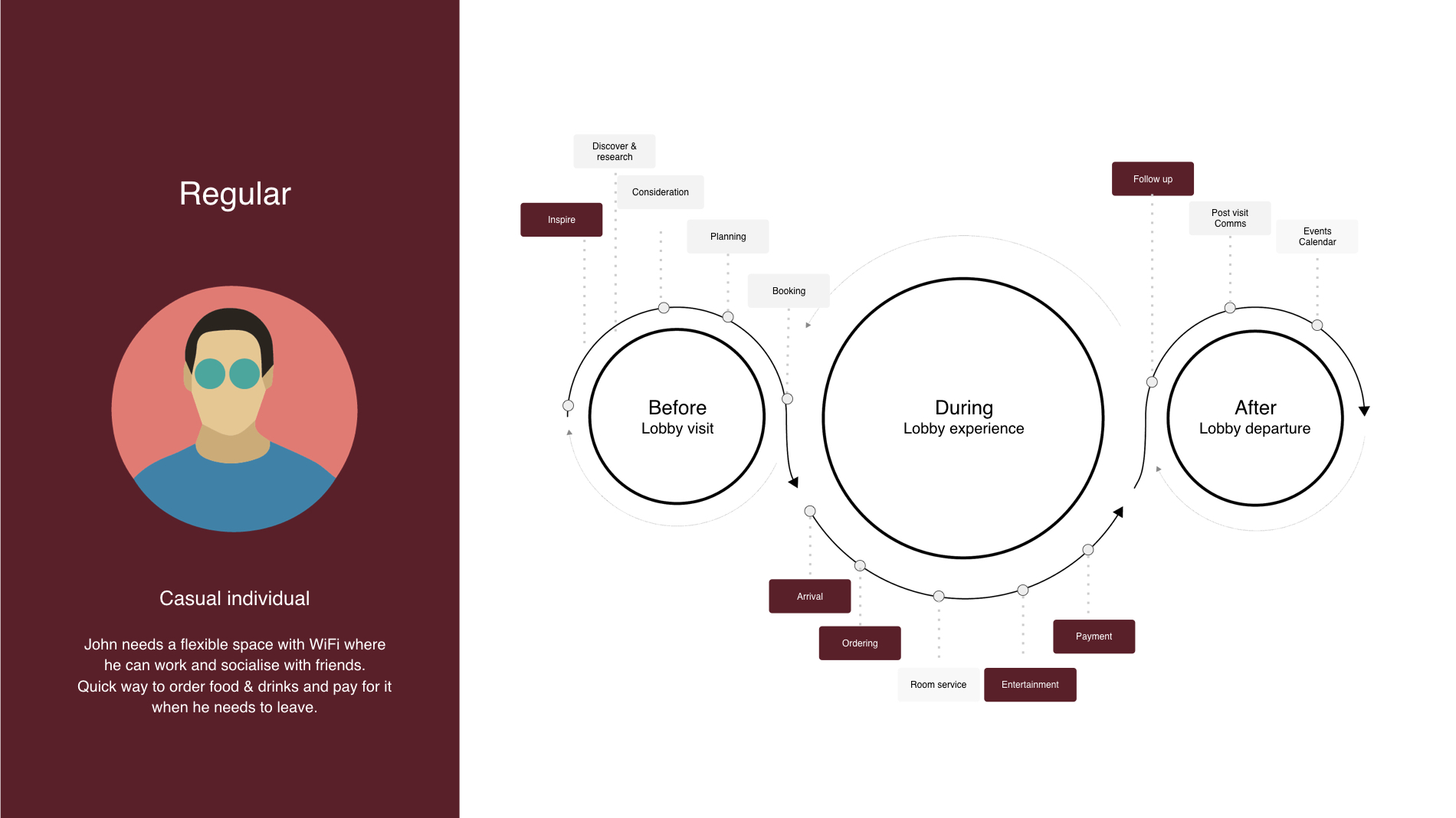
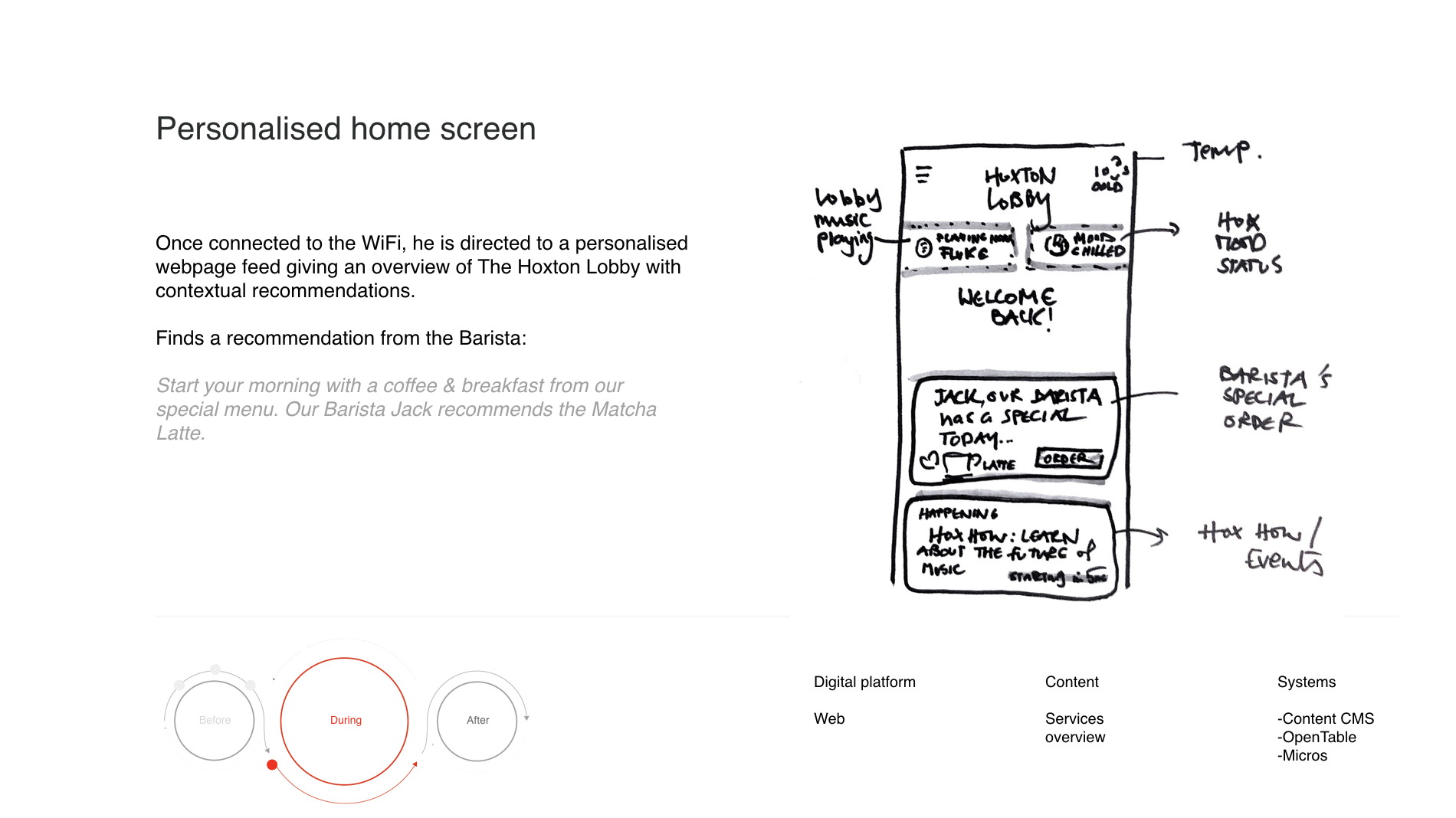
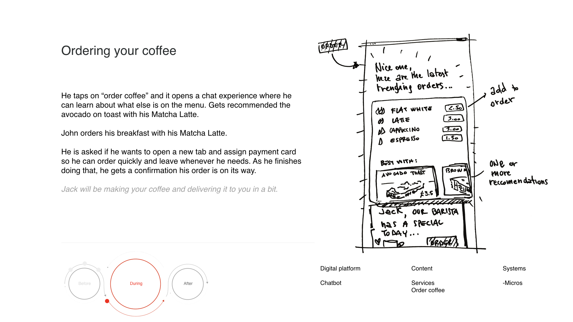
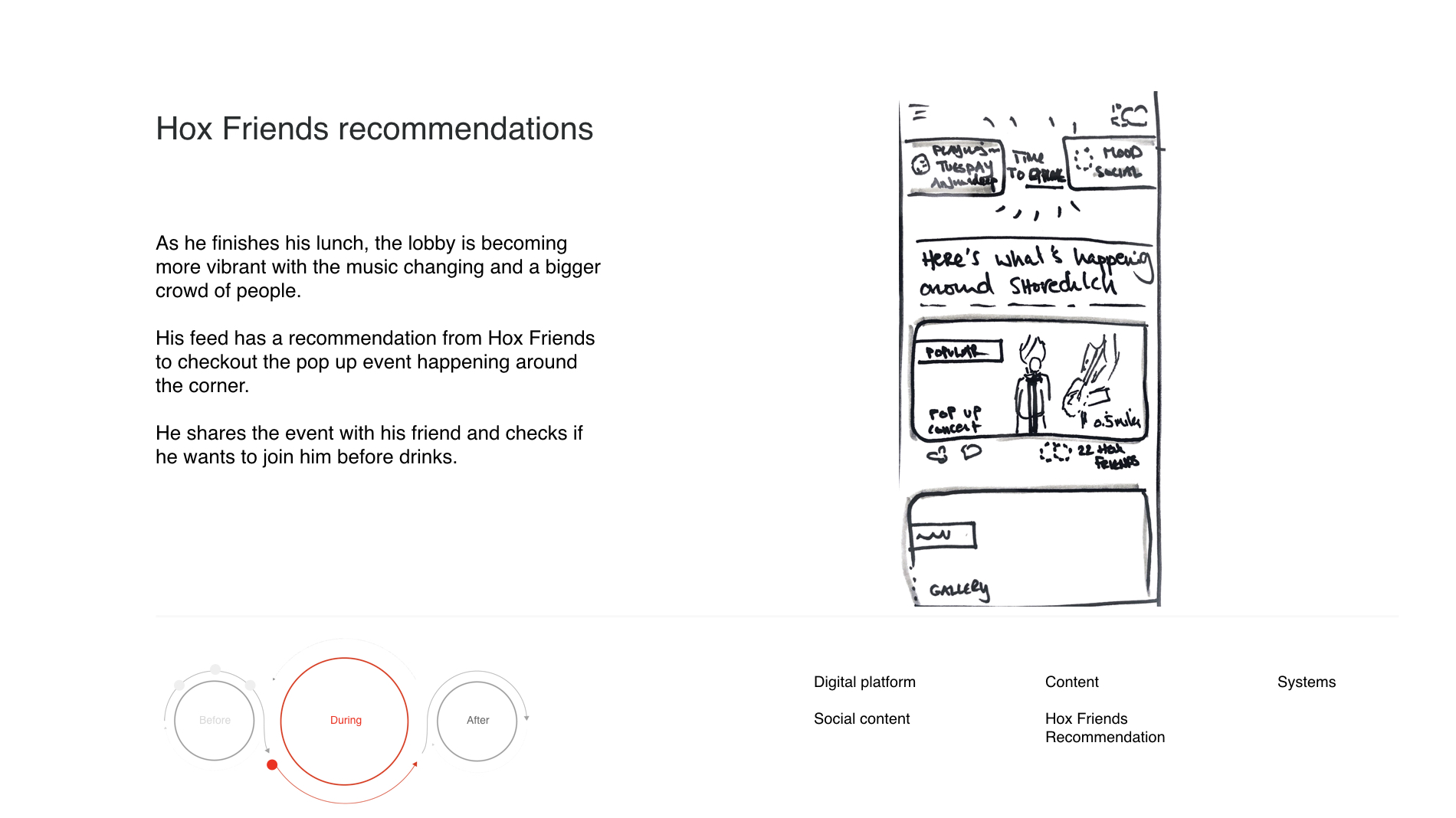
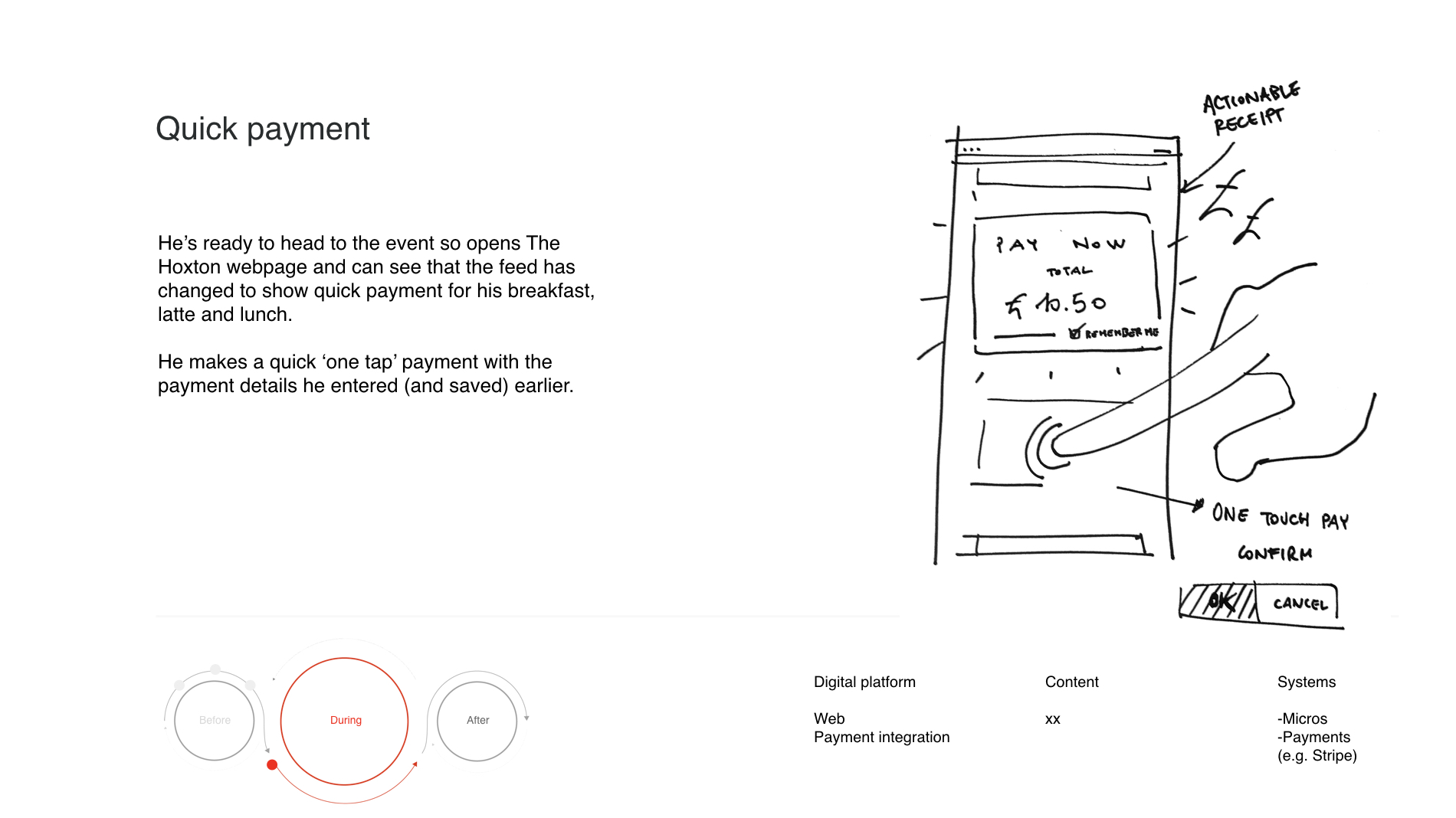
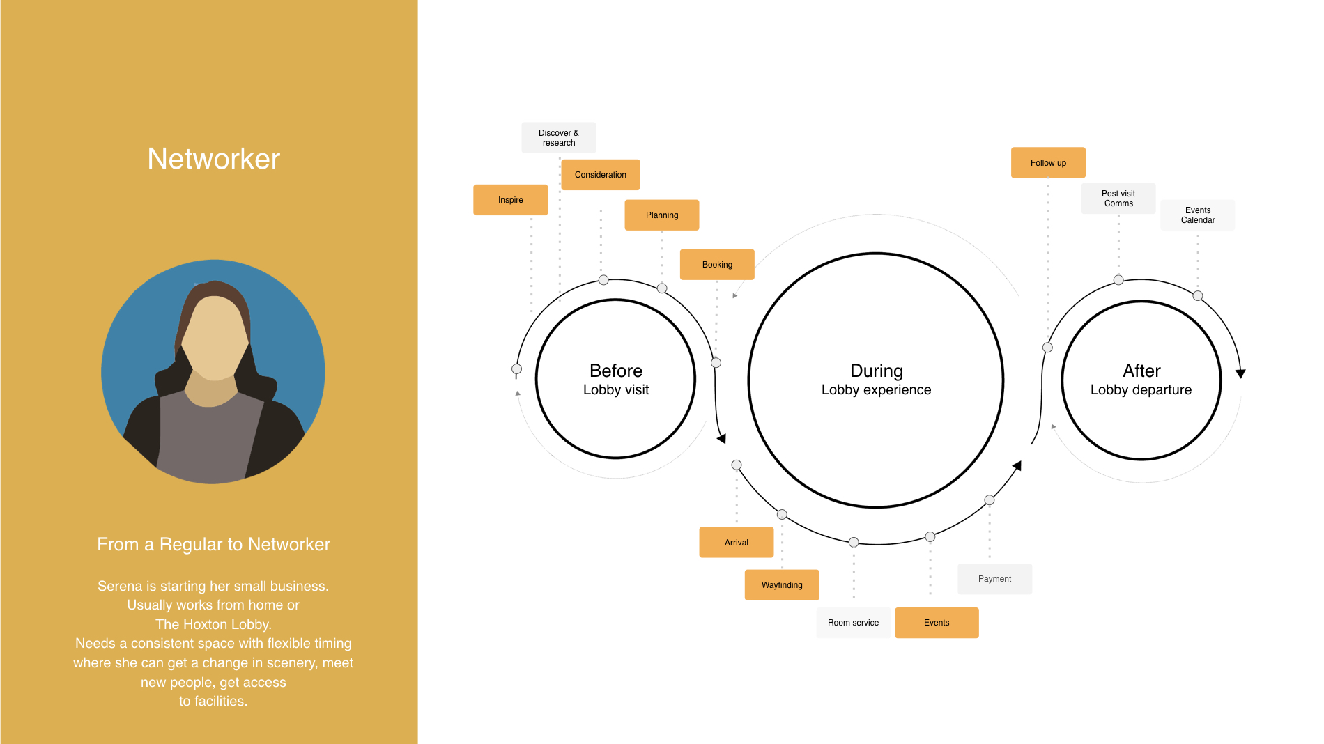

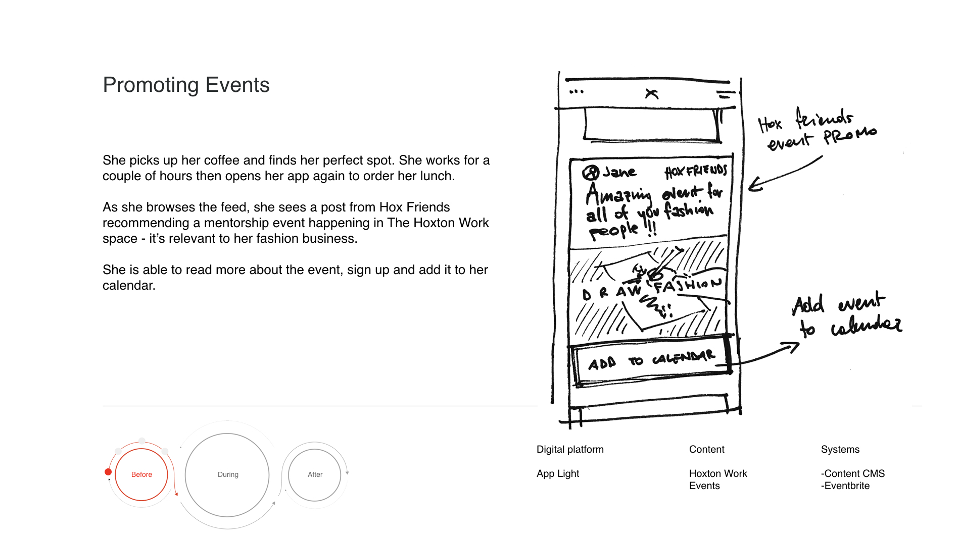
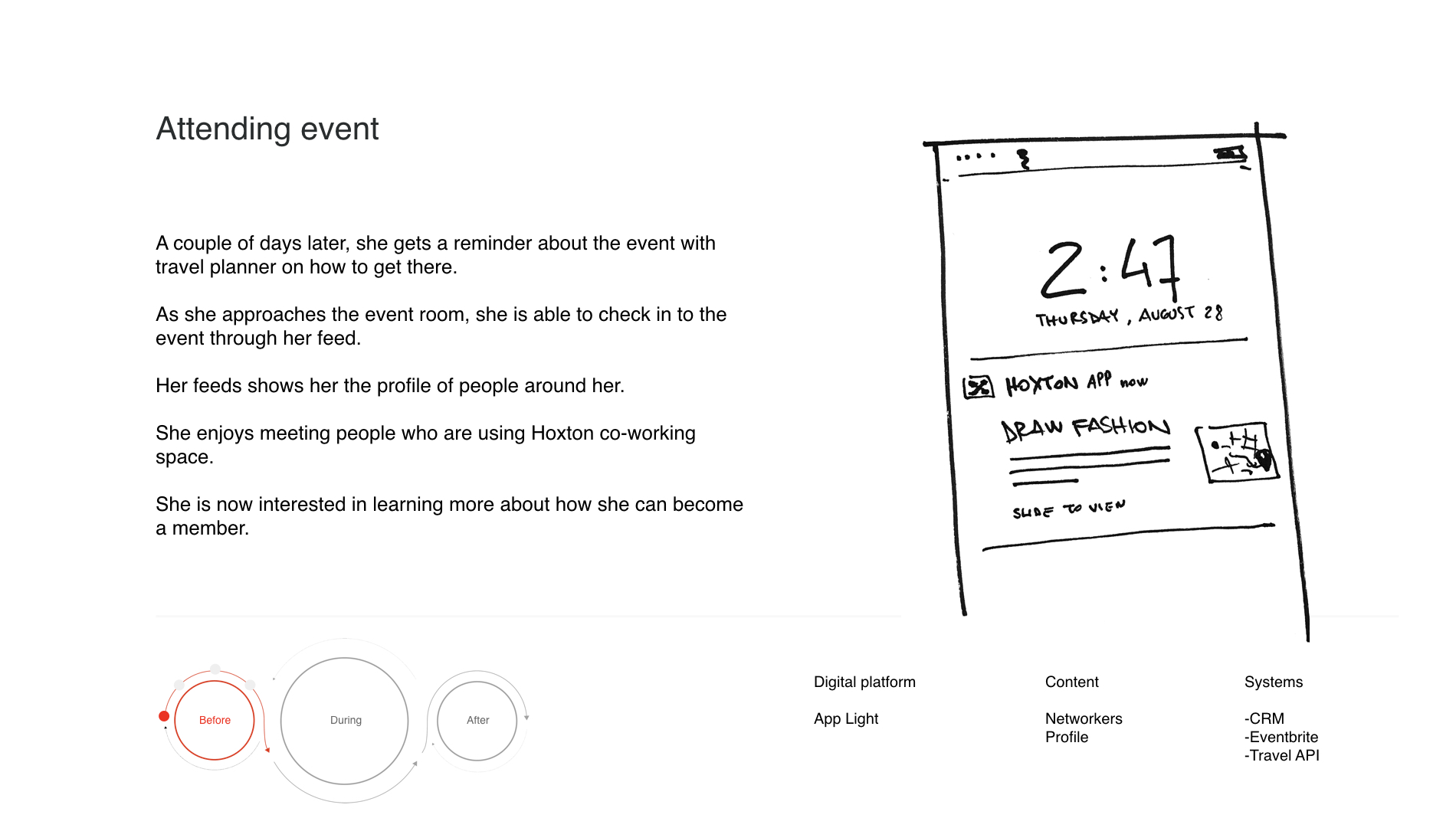
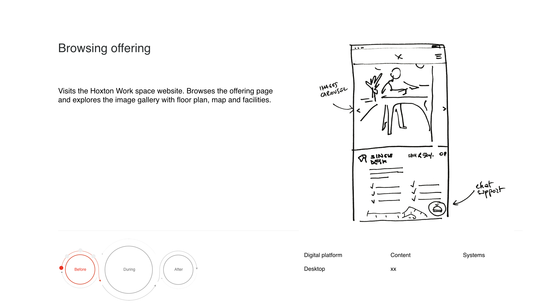
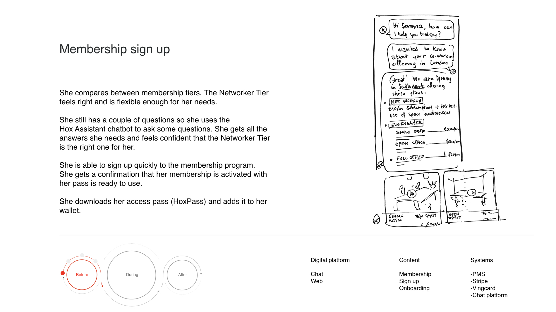
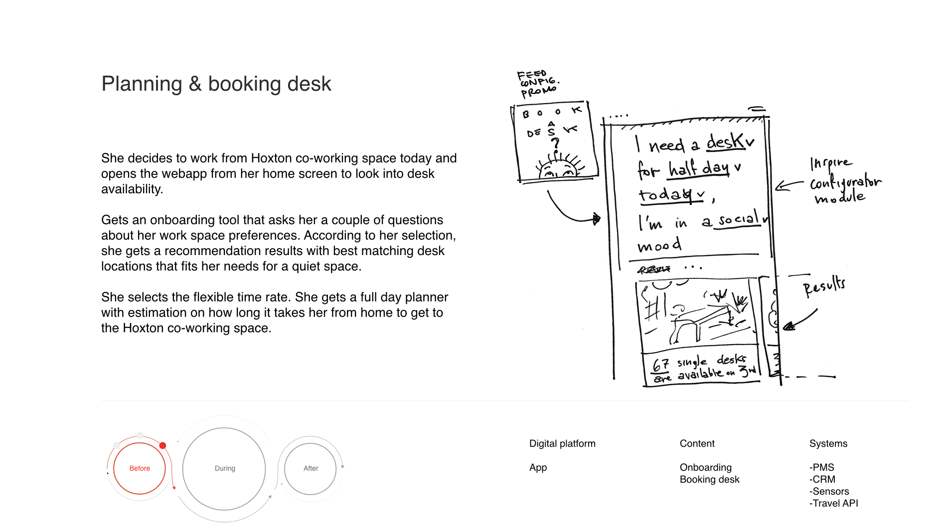
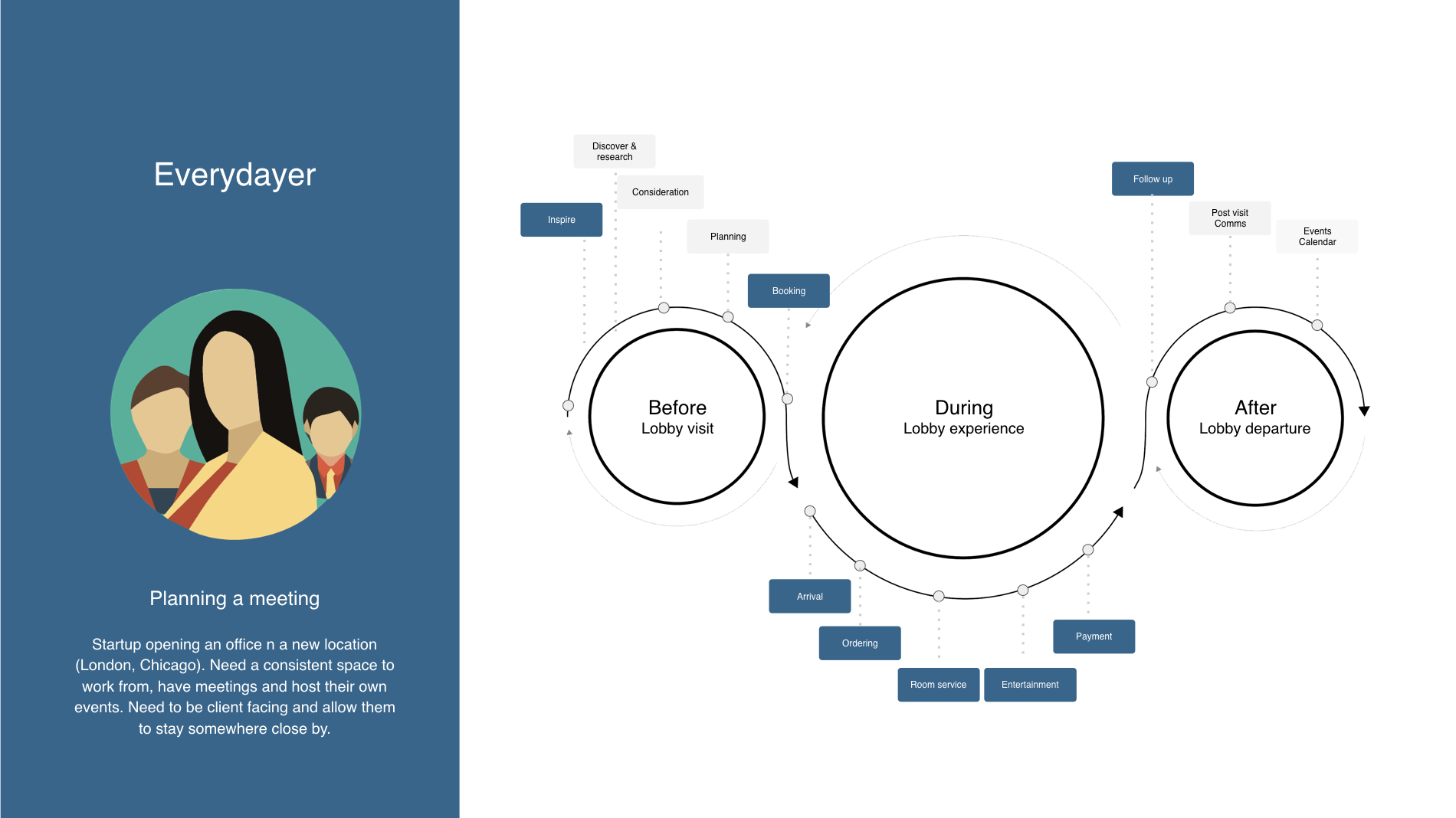
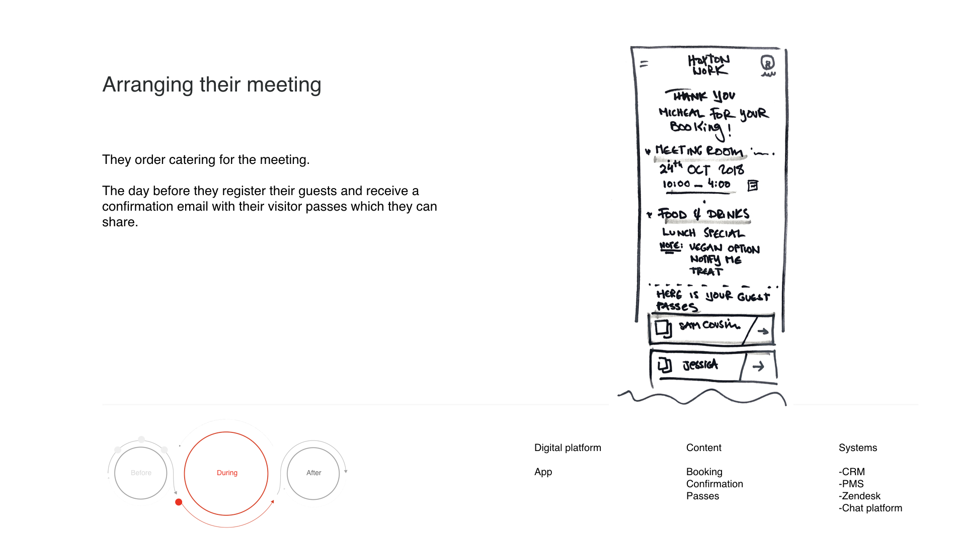
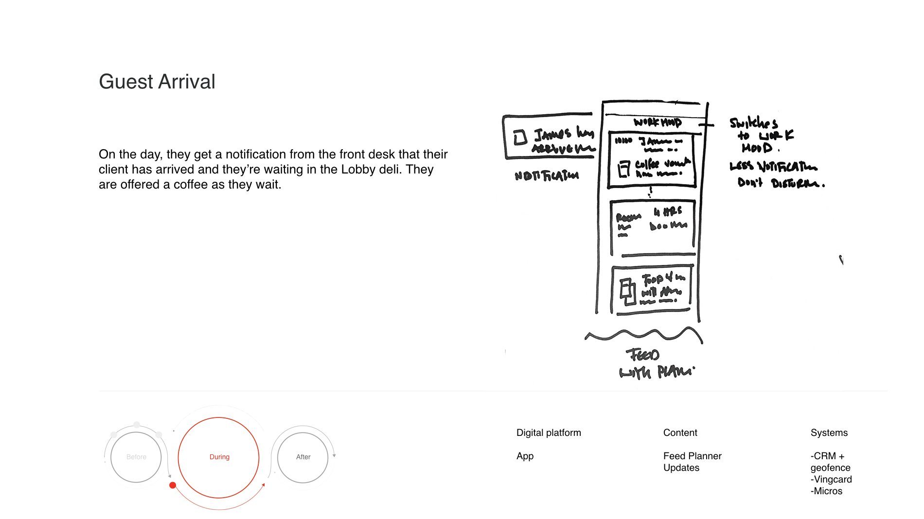
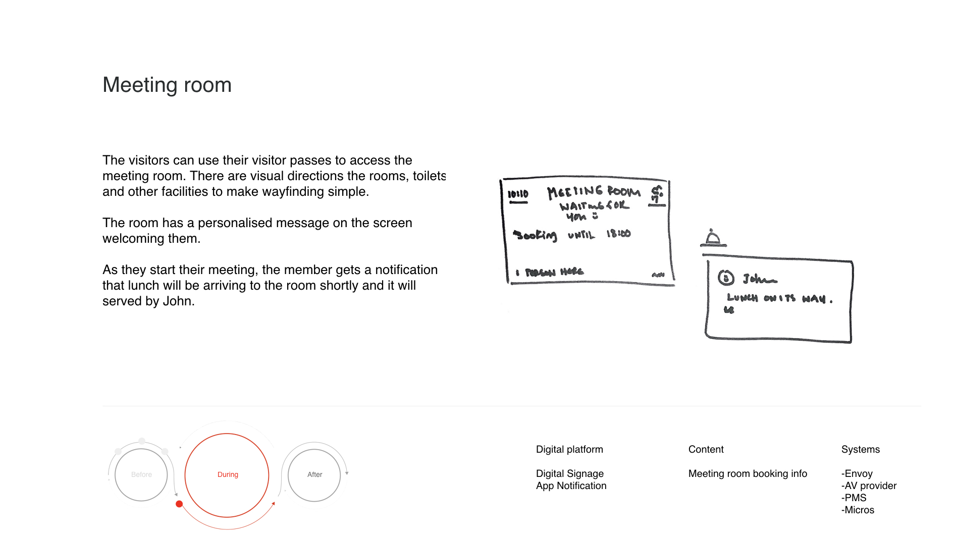
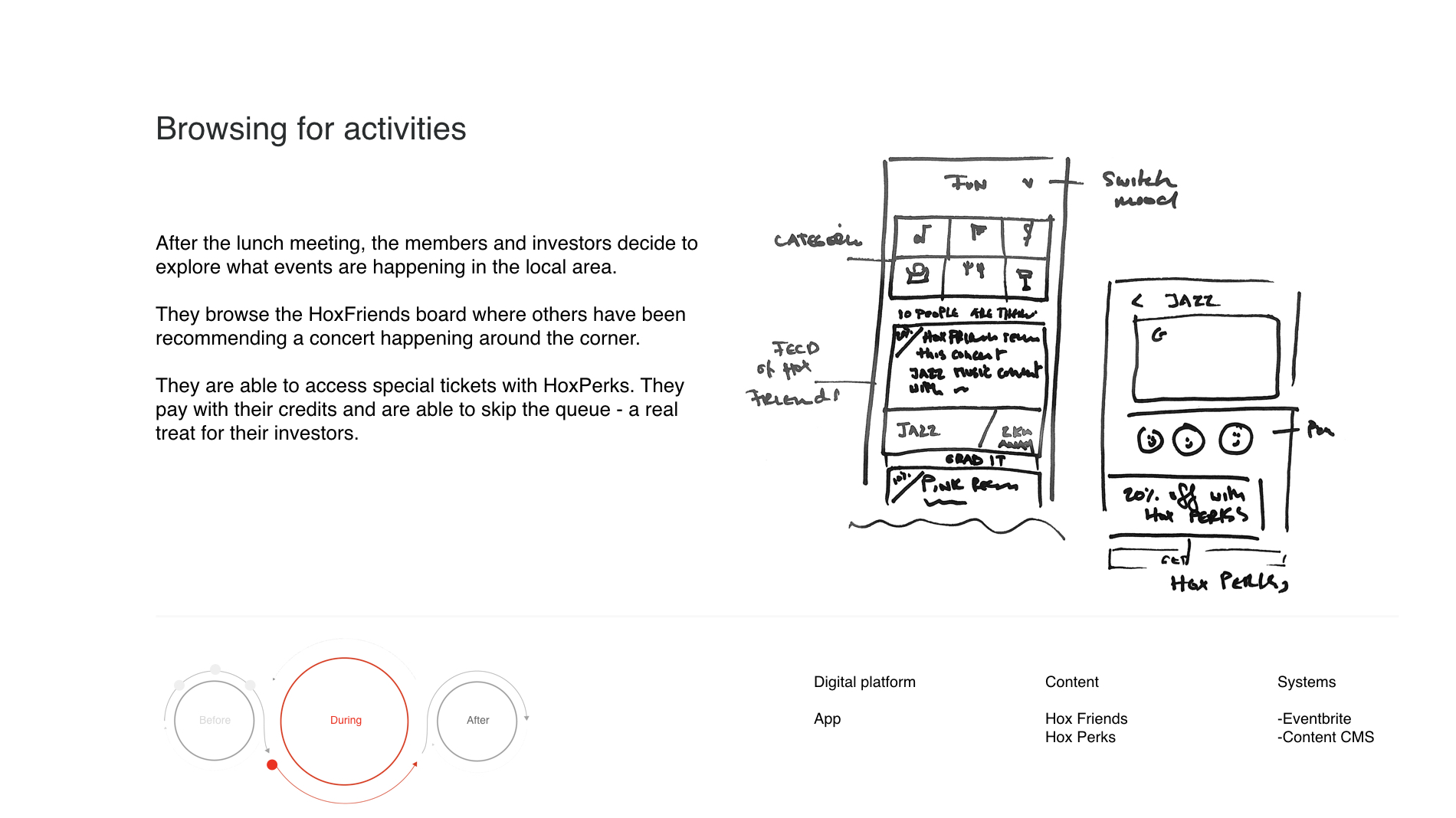
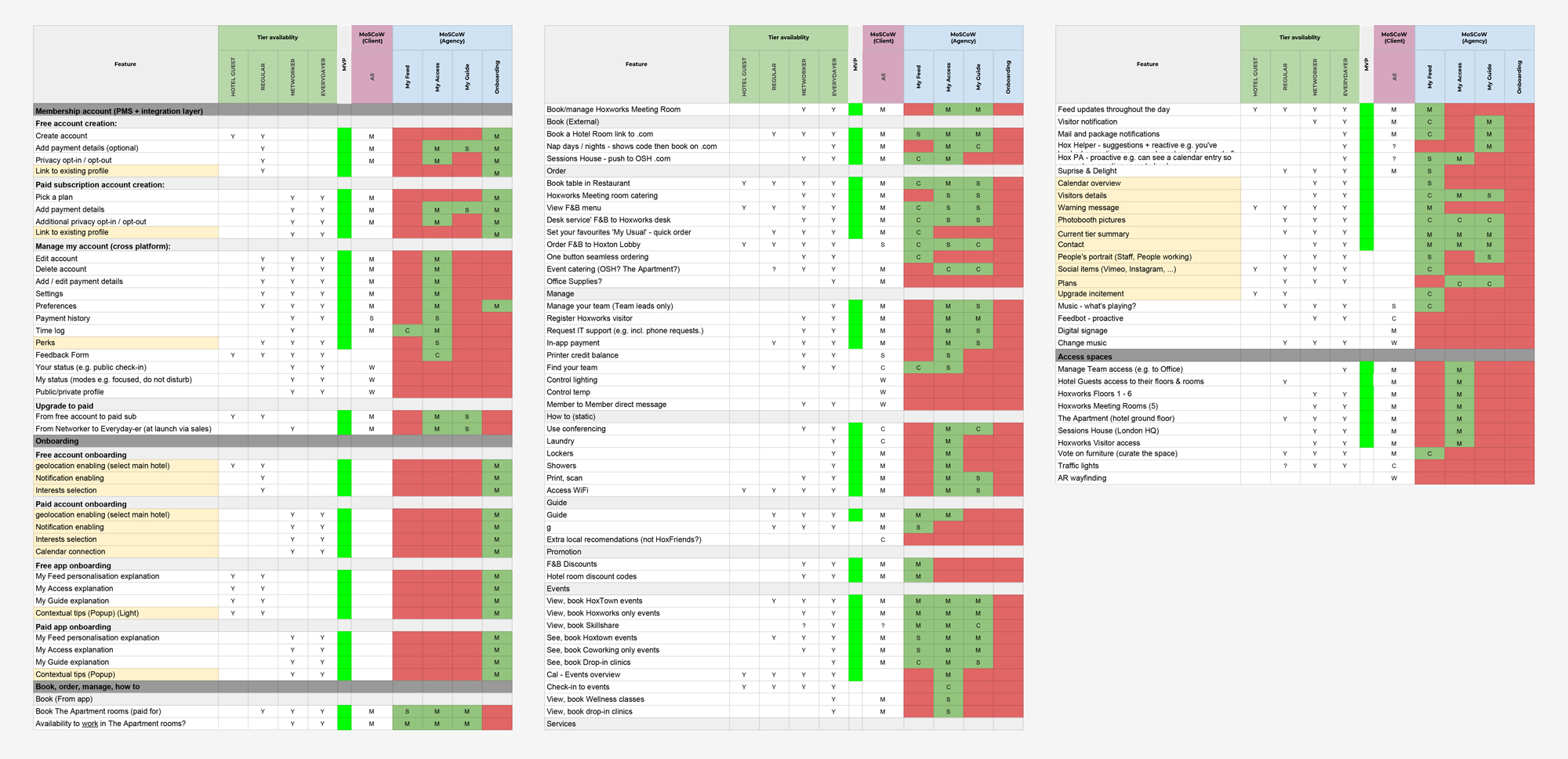
After defining personas and overall principles around the services we had a workshop with the client to define in details what features where required based on the MoSCoW method.
As we moved further into the definition of the structure, we decided to take a step back and bring back in mind our core principles we wanted to apply to the experience. That's how we came up with a simple navigation system breaking down the content into 3 categories:
My Feed (Spark):
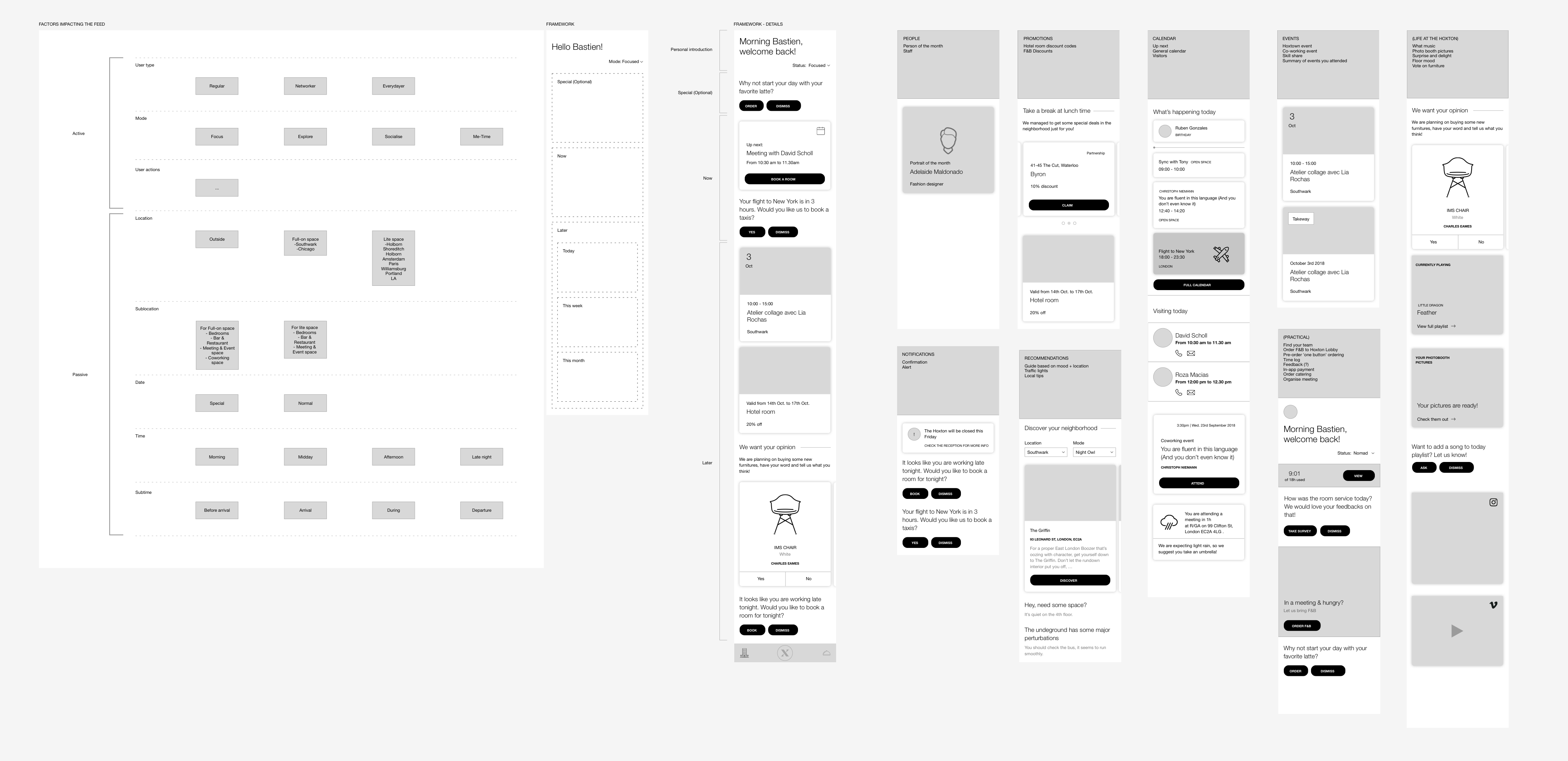
It's a curated and personalised area where the user can view and browse information that might interest him. All the features on the feed are sensitive to different aspects learning from the user: date, time, user actions, user types, Mode, ... in order to serve a truly bespoke feed. It can pull information such as relevant events, workshops but also going into more in-depth features such as proposing to book a room for a planned meeting or serve a specific favorite drink.
My Access (Simplify):
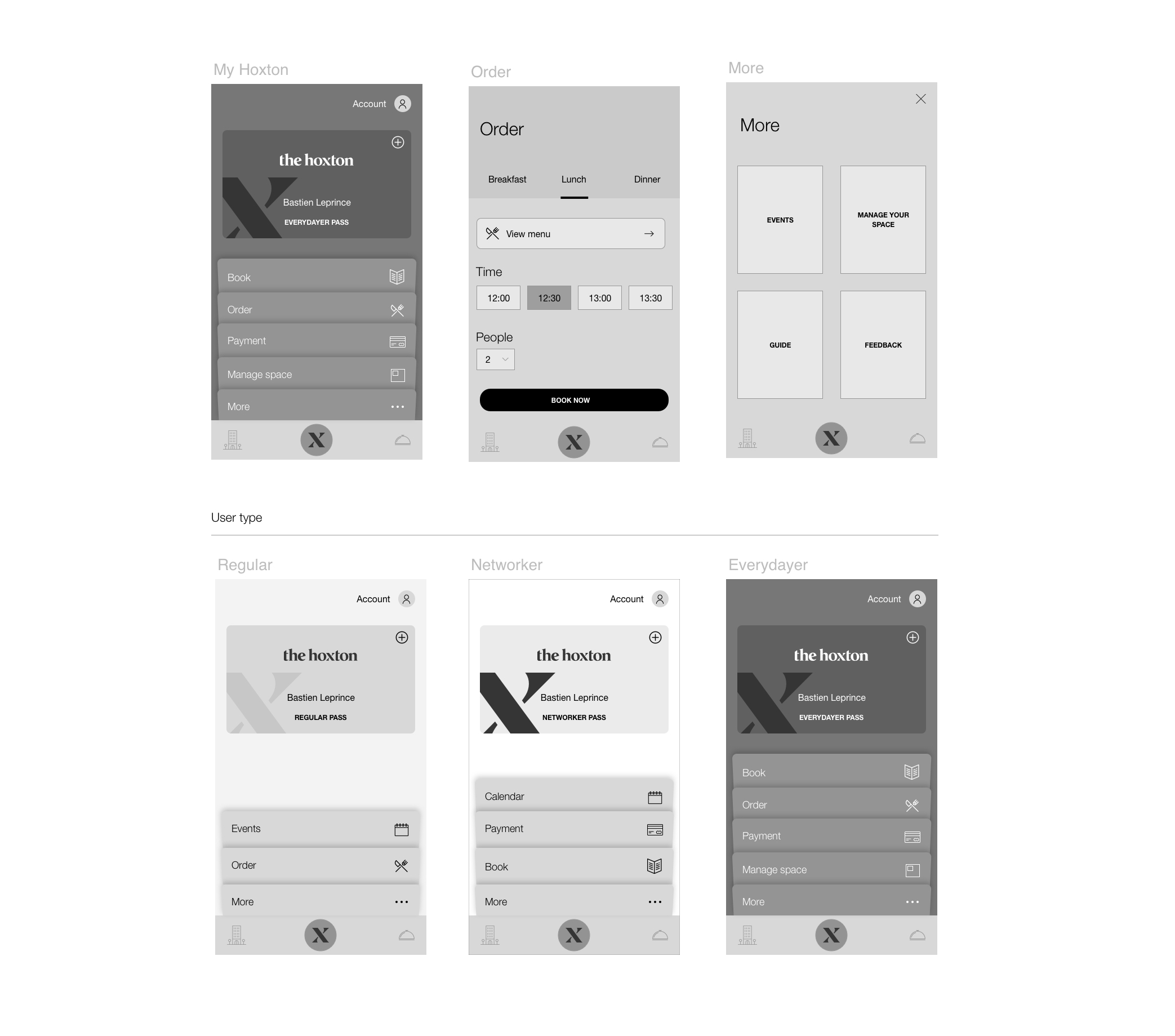
The user will have access to the relevant core features through here. This section is the underlying layer used if the user knows exactly what he is looking for. Everything here is made to achieve any task quickly from reordering the most used features to smart suggestions inside each of them. This is also the place where the hoxton access pass and account can be found.
My Guide (Service):
My Guide is a concierge bot where the user can quickly gather contextual information. It can also help you automate recuring actions in order to save you time.

The next steps for this project would be to refine each of the categories and their purposes to keep them complimentary and helpful. Each feature also needs to be define in details and then be tested to mirror exactly the different user needs. Rolling out features through the MoSCoW list previously done will be critical to work as organically as possible with the hoxton and the users. Finally monitoring the evolution of the product along the way will be necessary to have a better understanding of the different user behaviors.